grab our FREE
‘Do’s & Don’ts of what to add to your website’ Guide.
‘Do’s & Don’ts of what to add to your website’ Guide.
emails with additional helpful content.
Hi, we're so glad you found us.
We love helping creatives like you finally have the website you’ve always wanted.
few simple steps
Follow us
What are the different Typeface Categories?
In this blog, we’re breaking down the six different typeface categories. We’ll explain the similarities (and differences) between them and give examples so you can start trying them out today. Plus, you’ll learn which ones to use to give your work the most impact. And as with all our blogs, we’ll share some Insider Tips to help you feel like a Typeface pro!
Before we start – missed a part of our Type Tips Series? Catch up below.
- Where did the term Uppercase and Lowercase come from?
- Before you pick your Brand Font, ensure it has these 3 features.
- Type Crimes on your Website (are you committing any of these?)
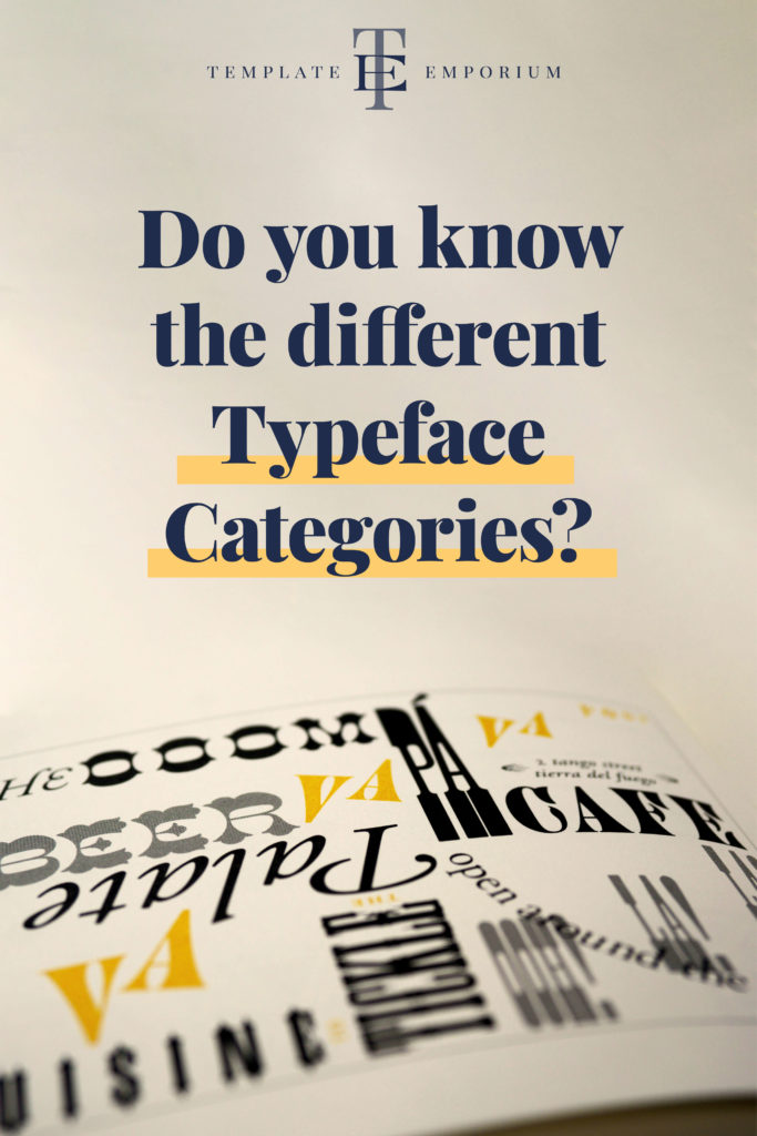
The individual styles of type are known as a Typeface. There are six different categories, and each one has a specific name. They include:
- Serif
- Sans-Serif
- Slab-Serif
- Script
- Monospaced
- Display
1. Serif Typeface

This style of typeface contains a finishing stroke in the form of a small line.
Another name for this line is a serif.
It sits at the end of the main stroke in a letter.
First introduced by the Romans, Serifs were created to clean up stone-cut letters to ensure the stroke endings were more graceful and allowed the eye to read them more easily.
Insider Tip
We like to distinguish a Serif typeface by remembering it has “little feet”.
Font Squirrel is an excellent source for Serif Typefaces.
Examples of Serif Typefaces
- Belwe Bold
- Bodoni
- Caslon
- Cooper Black
- Egyptian Condensed
- Fontanesi
- Lubalin Demi Bold
- Plantin
- Playbill
- Souvenir
- Tiffany Heavy
- Times New Roman
When to use Serifs
This typeface has a more traditional and classic feel and therefore works best in
headings and long sections of body copy text.
2. Sans-Serif Typeface
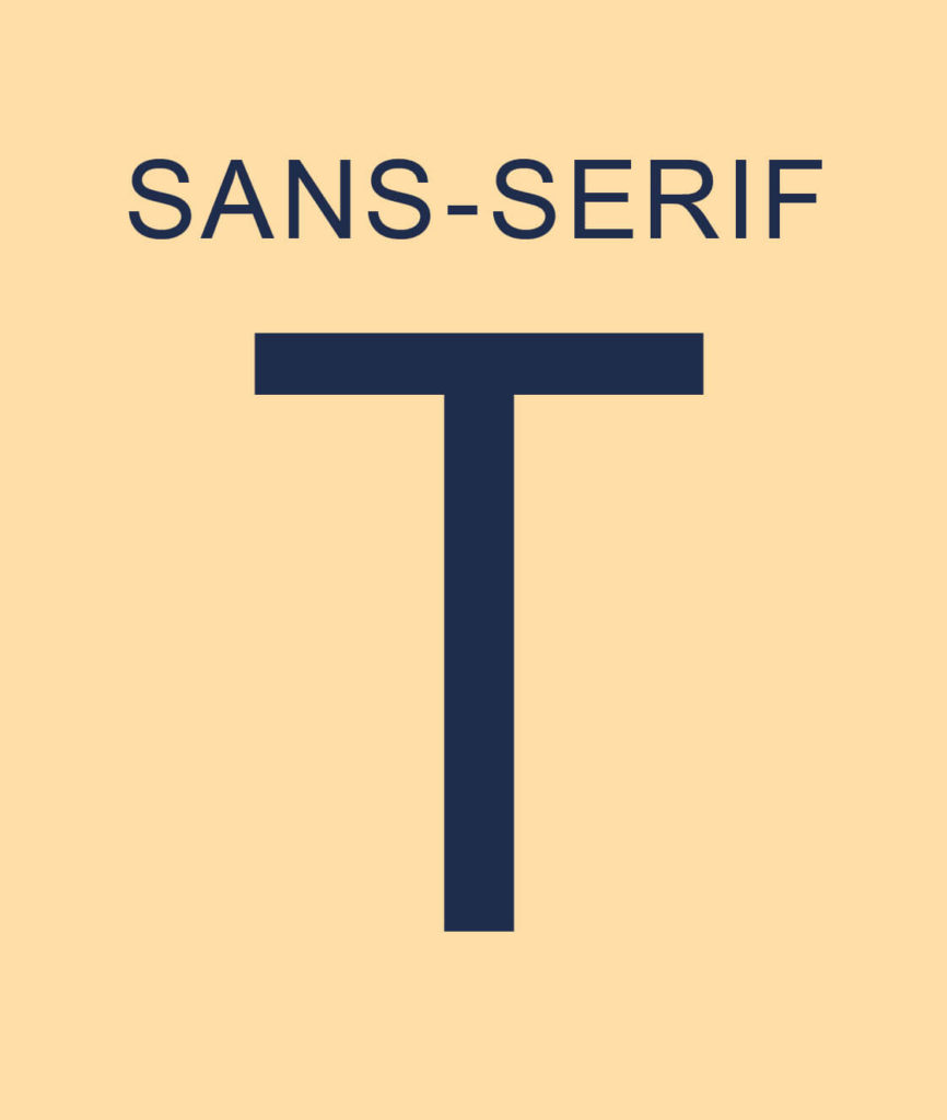
The word Sans means without, so unlike its cousin Serif, a Sans-Serif typeface has no serifs or “little feet” on the ends of the letters.
Even though this typeface dates back to the 19th Century, it has a more modern look than the Serif typeface.
This typeface is also popular on websites as it is easier to read on a digital screen.
Examples of Sans-Serif Typefaces
- Avenir
- Bauhaus
- Broadway
- Frankfurter
- Futura
- Gill Kayo
- Graphik
- Grotesque
- Helvetica
- Microgramma
- Promixma Nova
- Uptight Neon
Insider Tip
A great place to source fonts is also via Adobe Fonts or Google Fonts. Each platform will allow you to do a search for each typeface category such as Sans-Serif.
When to use Sans-Serifs
Another typeface that is great to use in headings and body copy.
More Insider Tips!
Whether you choose a Serif or Sans-Serif typeface, always pick one with an entire font family.
Whether you choose a Serif or Sans-Serif typeface, pick one that consists of an entire font family.
A font family = members consisting of Light, Regular, Italic, Bold etc. These different options will allow you to create balance, contrast and variety in your designs and work.
3. Slab-Serif Typeface
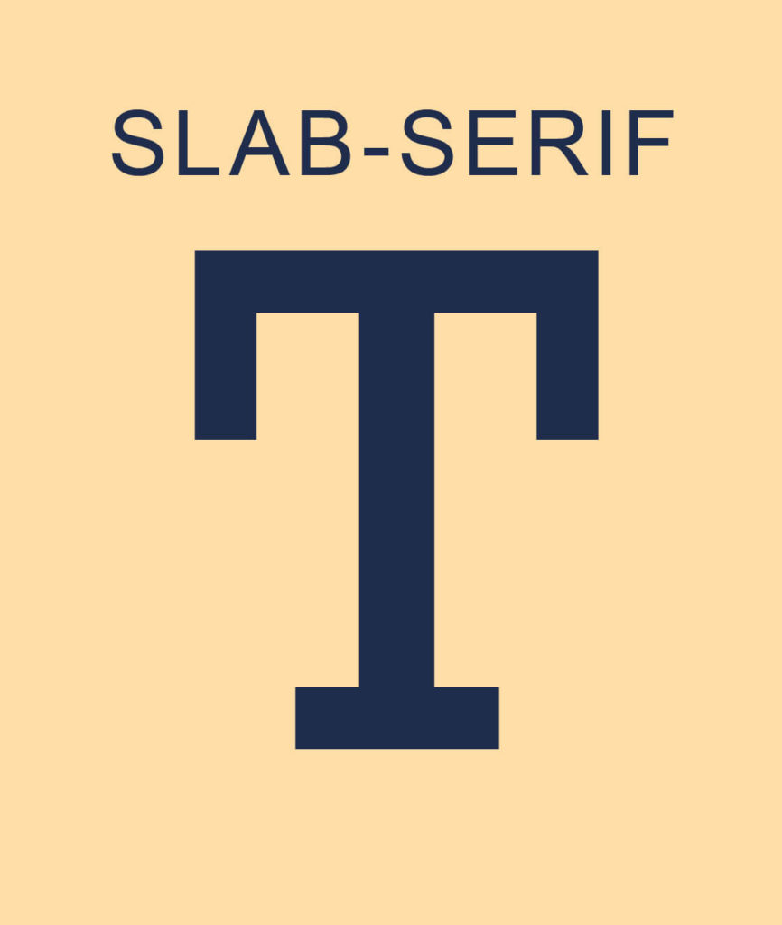
Whether you know it by its other names of Egyptian or Square Serif, the final member of the Serif family was introduced in the 19th Century.
Slab-Serif also has feet, but this time they are known as heavy flat feet.
Examples of Slab-Serif Typefaces
- Archer
- Bodoni Egyptian
- Clarendon
- Crete Round
- Josefin Slab
- Roboto Slab
- Rockwell
- Ultra
When to use Slab-Serifs
This typeface works best in headings due to its bold statement making it a popular choice on posters and billboards.
4. Script Typeface
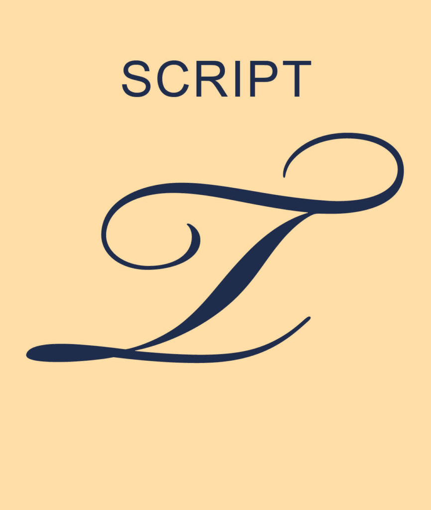
Taking a different typeface direction, we head into the cursive and decorative style of the Script typeface.
A Script Typeface looks like personal handwriting. It has a similar feel to cursive as the letters join together in a flowing style.
The look and feel of this typeface can vary from elegant and formal to friendly and inviting.
Examples of Script Typefaces
- Bickham Script
- Homemade Apple Pie
- Mr Dafoe
- Parisienne
- Reey
When to use Script
To ensure the typeface can be clearly read, only use Script in headings. When used in the body copy or reduced in size, the Script typeface becomes impossible to read.
BONUS – Handwritten Typeface

For a personal feel or to replicate your own handwriting, a handwritten typeface is a perfect substitute.
Similar to the Script typeface, only use Handwritten for headings or as a sign-off that represents your signature.
Avoid using it in large paragraphs of copy as it will make it impossible to read and will cause frustration for the reader.
5. Monospaced Typeface
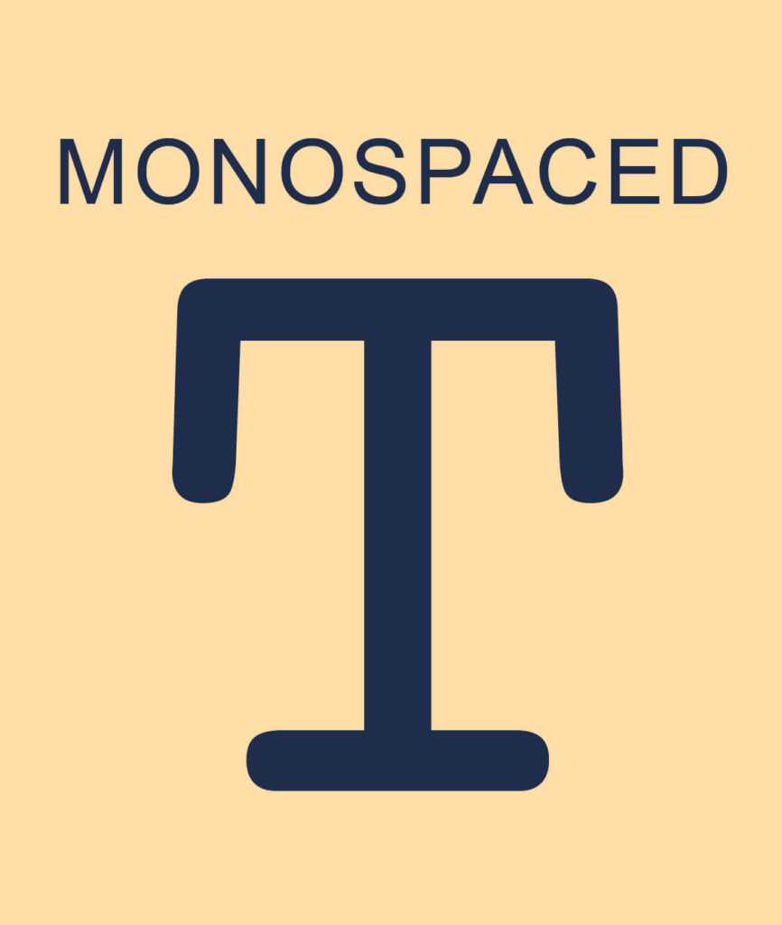
Again dating back to the 19th Century, think of this as the “typewriter” typeface. With its thick, heavy rounded edges it has a distinct style to it.
What is unique about this typeface is that most of the characters take up the same amount of horizontal space.
When to use Monospaced
This typeface is clear and easy to read so is perfect for use in forms and is the font of choice in coding.
Examples of Monospaced Typefaces
- Courier
- IBM Plex Mono
- Inconsolata
- Roboto Mono
- Source Code Pro
6. Display Typeface
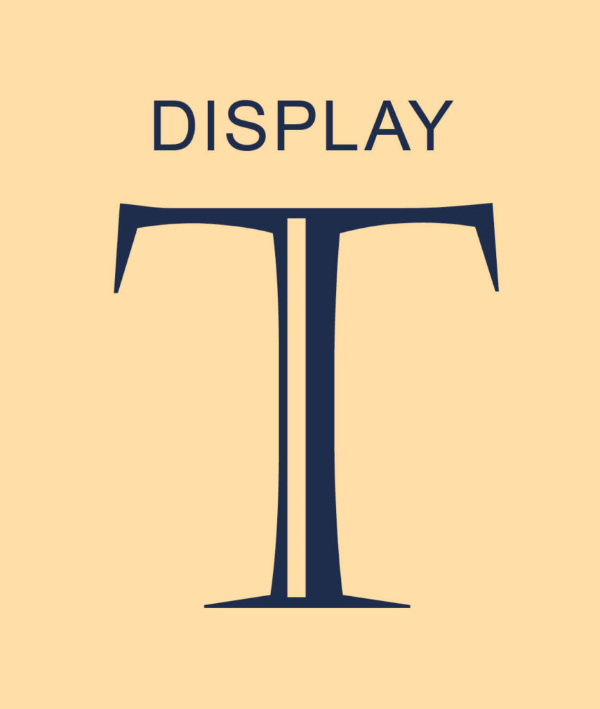
As the name describes, this typeface is perfect for decorative purposes and design impact in large-sized headings.
When to use Display
Due to its intricate details, keep this typeface for headings where its decorative impact can be felt. Avoid using this in body copy or paragraphs of text.
You did it!
That’s a wrap on What are the different Typeface Categories?
You can now easily distinguish between a Serif, Sans-Serif, Slab-Serif, Script, Monospaced and Display Typeface. Plus, you can use all of our insider tips to ensure you always use the correct one for the job!
Where to Now?
Want more Font tips?
- Our 5 Favourite Google Font Pairings for your website.
- How to Update Master Fonts in Showit
- Brand Style Guides Explained (& why your business needs one now!)
Like the Blog Post?
PIN IT FOR LATER. And for more helpful tips follow us on PINTEREST.
Search
Create & launch your website in a
few simple steps
FREE GUIDE
While you’re here,
grab our FREE
‘Do’s & Don’ts of what to add to your website’ Guide.
‘Do’s & Don’ts of what to add to your website’ Guide.
When you sign up, we’ll send you
emails with additional helpful content.
About Lavinia & Tom
Hi, we're so glad you found us.
We love helping creatives like you finally have the website you’ve always wanted.
Blog Categories
Follow us