grab our FREE
‘Do’s & Don’ts of what to add to your website’ Guide.
‘Do’s & Don’ts of what to add to your website’ Guide.
emails with additional helpful content.
Hi, we're so glad you found us.
We love helping creatives like you finally have the website you’ve always wanted.
few simple steps
Follow us
How to Use Harmonious Colour Combinations in Your Designs
Whether you’re a Surface Pattern Designer, Artist or Illustrator, working with colour is a big part of your design work. And coming up with new colour palettes and combinations can be exhausting. When we get stuck designing a new website template, we often turn to Harmonious Colour Combinations.
In this blog, we’ll discuss how to use the colour wheel to find harmonious colour combinations, (including all seven varieties) we’ll also reveal what they are and the formula to create them.
Before we start – missed a part of our Colour Tips Series? Catchup up below.
- Hues, Tints, Tones & Shades – What’s the difference?
- Our Top Four Free Colour Generator Sites
- The number one Printing Tip you need to know
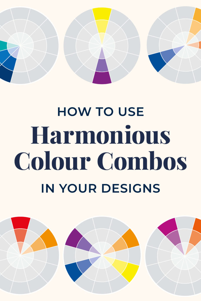
Harmonious Colour Combinations
1. Monochromatic Colour Palette
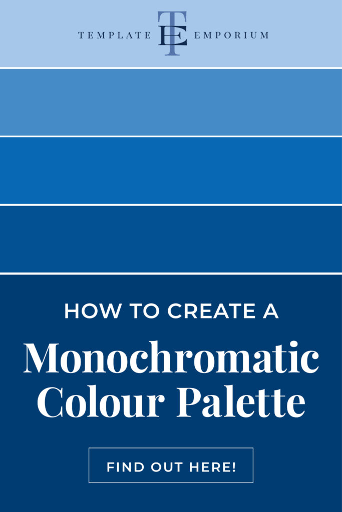
Firstly, let’s begin with the Monochromatic colour scheme and discover how by only using one colour you can create an entire colour palette.
What is a Monochromatic Palette?
- This is using one single colour (Hue).
- In our example, we’ve used Blue.
- To expand the use of this colour, create an entire palette by using the different Values of the colour.

Dark Values – Shades
- Here’s how to create a monochromatic palette.
- Use the Base Colour (hue) + different Shades.
- Create a Shade by adding Black to the Hue.

Medium Values – Tones
- Next, we’ll add to our monochromatic palette.
- Add the Base Colour (hue) + different Tones.
- To create a Tone, add Grey to the Hue.

Light Values – Tints
- Let’s keep adding to our monochromatic palette.
- Take the Base Colour (hue) + different Tints.
- To create a Tint, add White to the Hue.
The Final Monochromatic Palette
In conclusion, by using the tips above, our completed monochromatic palette consists of the original colour (hue) plus shades, tints and tones of this one colour. Check out the example below.
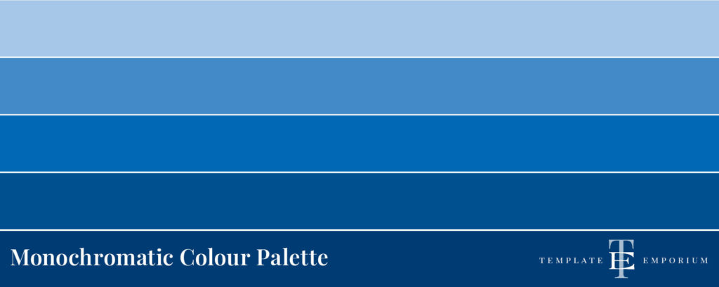
Harmonious Colour Combinations
2. Analogous Colours
Secondly, we’ll dive into Analogous Colours and learn how this three-colour combo can create stunning results.

What are Analogous Colours?
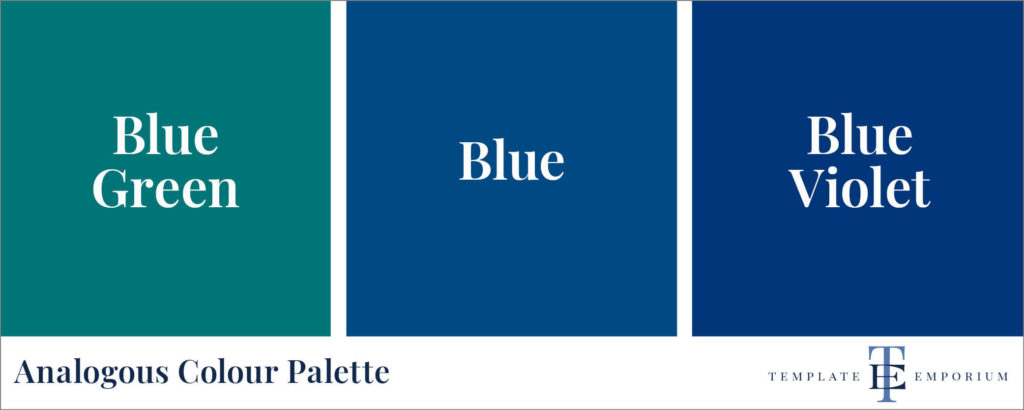
These are three colours that are side by side on the Colour Wheel.
- Firstly, pick your main colour.
- Next, find the colours on either side.
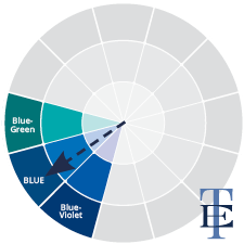
Adjacent Colours on the Wheel.
All these colours share a common colour Blue.
- On one side of the Blue is Blue-Green.
- The other side of the Blue is Blue-Violet.
Analogous Colours always work well together
Here’s Why:
- They always have one colour in common. Such as Blue being present in our example.
- All colours share strong undertones.
- Create low-contrast harmony.
- Are easy on the eye.
The final result is a rich, beautiful and harmonious colour palette.
Harmonious Colour Combinations
3. Complimentary Colours
Thirdly, we’ll look at a colour combination you may be more familiar with – Complimentary Colours.
What are Complimentary Colours?
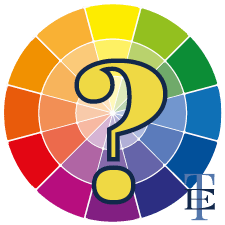
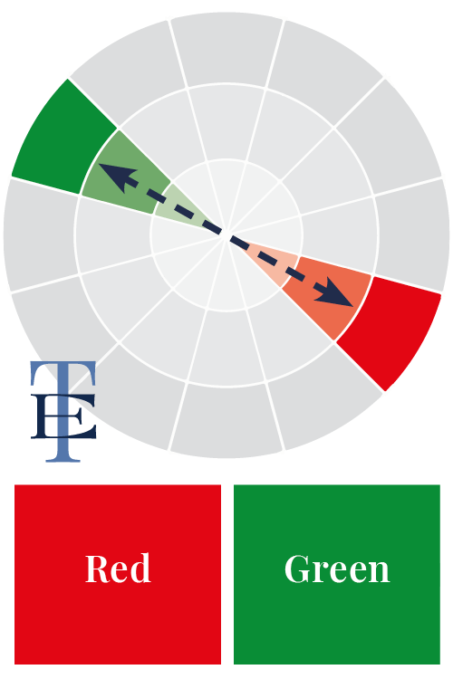
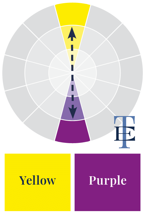
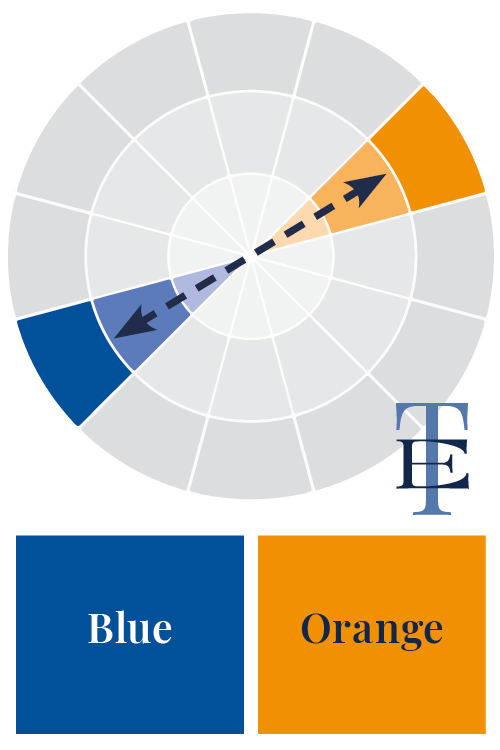
- These are opposites on the colour wheel.
- When used together, they bring out the best in each other.
- Because they don’t share a common colour, this creates tension and energy.
- To create an interesting contrast, mix in tints, tones and shades of colours.
For example, Red & Green, Yellow & Purple or Blue & Orange.
Harmonious Colour Combinations
4. Split Complimentary
Fourthly, think of this colour combo as the cousin of Complimentary – Split Complimentary. We’ll explain the differences below.

What are Split Complimentary Colours?
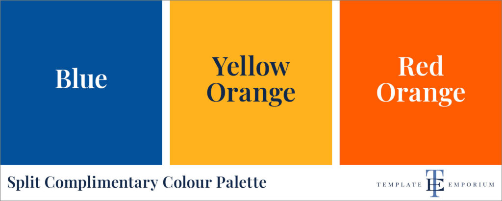
- Three colours opposite each other on the colour wheel.
- Firstly, find your primary colour (in this case, Blue).
- Next, find the 2 colours on either side of the complementary.

Split Complimentary Colour Names
- Blue’s complimentary Colour is Orange.
- The two colours on each side of the Orange are:
- Yellow-Orange & Red-Orange.
Split Complimentary Colour Palette
Insider Tip
To create an interesting contrast, try to mix in tints, tones & shades of the three colours.
Harmonious Colour Combinations
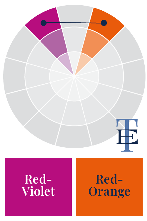
5. Diadic Colour Scheme
In the fifth spot is a colour combination you may not have heard of before – Diadic.
What are Diadic Colour Schemes?
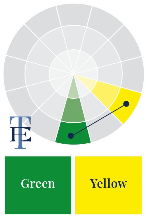
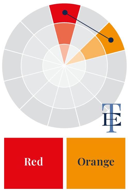
This colour formula uses two colours that are one colour apart on the colour wheel.
For instance, Green & Yellow, Red & Orange or Red-Violet & Red-Orange.
Harmonious Colour Combinations
6. Triadic Colours
In sixth place, is another less common colour combination known as Triadic.

What is a Triadic Colour Scheme?
- The Triadic colour formula uses colour sets of three colours.
- These colours are equally spaced from each other on the colour wheel.
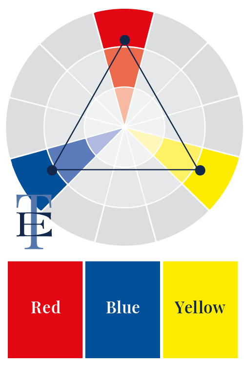
Triadic Scheme – Primary Colours
- This colour set forms a perfect triangle.
- The triangle comprises the Primary colours – Red, Blue and Yellow.
- The result is a striking colour combination.
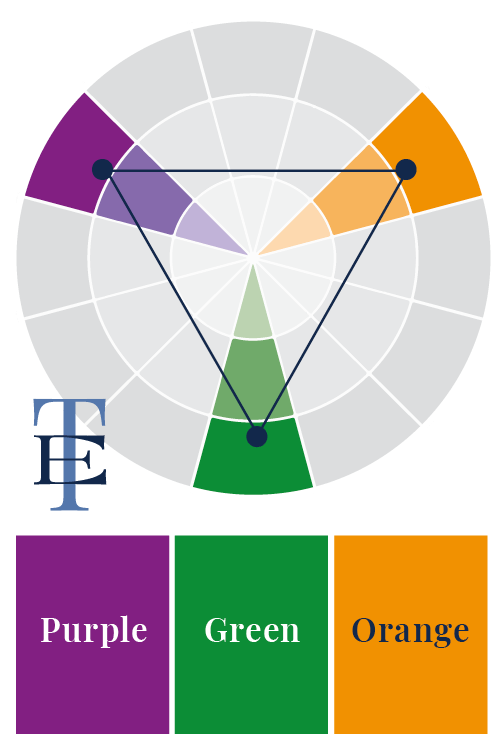
Triadic Scheme – Secondary Colours
- In this example, another perfect triangle colour combination is created.
- This time it’s using the Secondary Colours – Purple, Green and Orange.
- To create a triadic palette, use the key colour plus its tones, tints and shades.
Harmonious Colour Combinations
7. Tetradic Colour Scheme
Lastly, we’ll look at the Tetradic colour scheme, which combines the most colours out of all of our colour combinations.
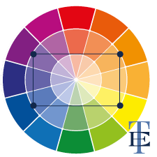
What are Tetradic Colour Combinations?
- This formula uses four colours on the wheel.
- Each colour set forms a rectangle on the colour wheel – as shown in the example on the left.
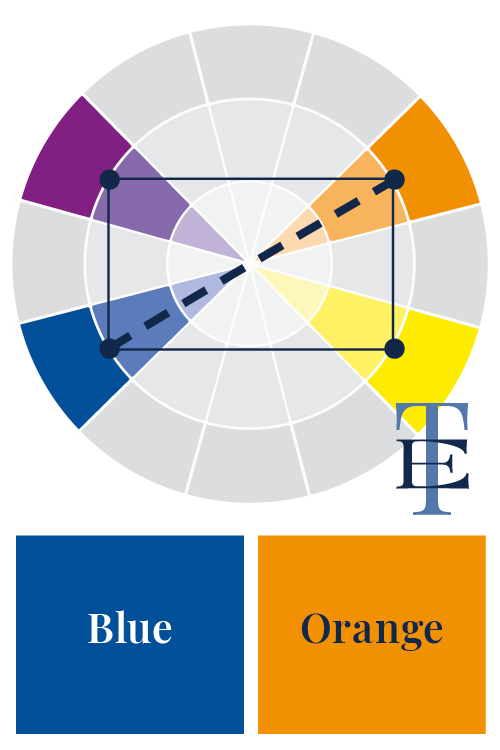
Tetradic Colour Scheme
- The rectangle consists of two sets of complementary colour pairs.
- For instance, Blue & Orange.
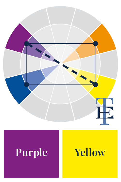
Tetradic Colour Scheme
- Using the second side of the rectangle gives us the other half of the colour combination.
- In this example, it’s Purple & Yellow.
How to use your Tetradic Colour Palette
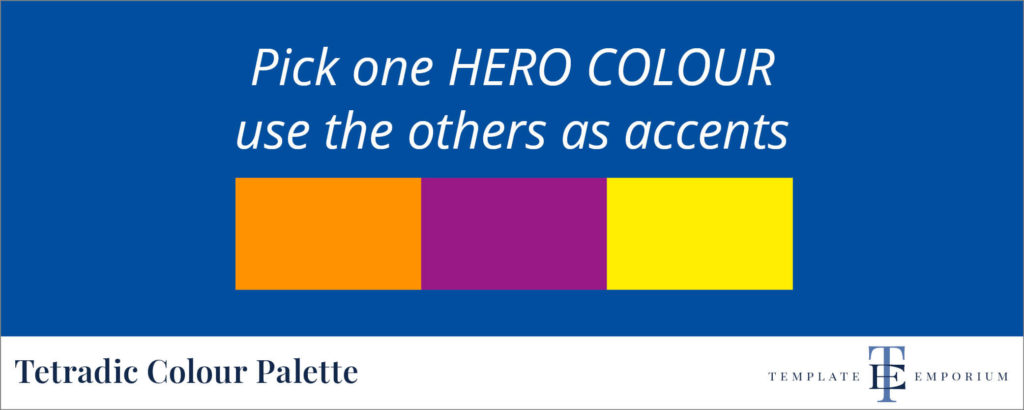
Always start with your hero colour, for example, Blue. Then, use the remainder three colours in smaller quantities or as accents.
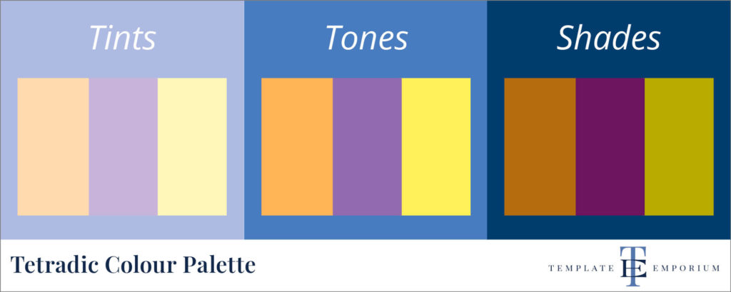
However, if you want to add variety & balance to your Colour Palette, try including tints, tones and shades of all four colours.
You did it!
That’s a wrap on How to use Harmonious Colour Combinations in your Designs.
Which harmonious colour combo will you use in your next design? Will, you try Monochromatic, Analogous, Complimentary, Split-Complimentary, Diadic, Triadic or Tetradic?
Let us know. And in the meantime, follow us on Pinterest for more blog posts like this.
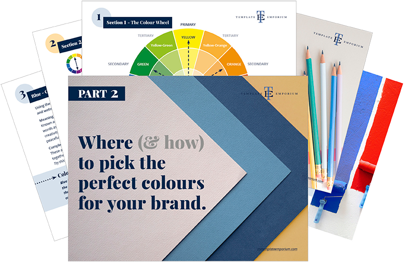
Want to incorporate these colours into your branding?
Download our FREE Where (& how) to pick the perfect colours for your brand.
Where to now?
For more Colour Combination tips check out the following.
- What’s the difference between Primary & Secondary colours?
- Check out our Branding Colour Series – Starting with Blue.
- The All Seasons Colour Combinations.
Like the Blog Post?
PIN IT FOR LATER. And for more helpful tips follow us on PINTEREST.
Search
Create & launch your website in a
few simple steps
FREE GUIDE
While you’re here,
grab our FREE
‘Do’s & Don’ts of what to add to your website’ Guide.
‘Do’s & Don’ts of what to add to your website’ Guide.
When you sign up, we’ll send you
emails with additional helpful content.
About Lavinia & Tom
Hi, we're so glad you found us.
We love helping creatives like you finally have the website you’ve always wanted.
Blog Categories
Follow us