grab our FREE
‘Do’s & Don’ts of what to add to your website’ Guide.
‘Do’s & Don’ts of what to add to your website’ Guide.
emails with additional helpful content.
Hi, we're so glad you found us.
We love helping creatives like you finally have the website you’ve always wanted.
few simple steps
Follow us
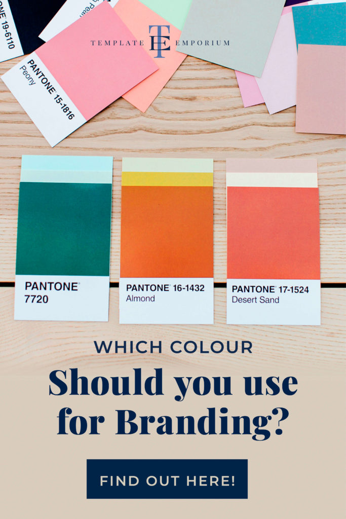
Which Colour should you use for your Branding?
Throughout our Branding Colour Series, we looked at all the Primary, Secondary and Neutral colours (plus a bonus Pink). For each colour, we took a deep dive using our three-part system that discovered each colour’s meaning, varieties and how to use this information in your branding.
In this blog, we’ve gathered all twelve colours together so you can get a complete overview and finally decide which colour you should use for your branding.
Wait, before we get started
Did you know there’s a way to use your Brand Colours to make your website pop? Our customised image enhancement pack will colour-grade your photos to match your brand colours. Match your photos to your Brand Colours here.
Now, are you ready to enter The World of Colour? Let’s go!
Primary Colours
Blue, Red and Yellow are the three Primary Colours, and because they can’t be made from any other colour, they are also known as pure colours.
Want to learn more about Primary colours? This blog post will help.
Blue
Starting with the world’s most popular colour – Blue.
In this blog, you’ll find:
- The many meanings of Blue – and how what you thought it meant depends on the shade you pick. We’ll break down the difference between light, bright & dark blues and determine which one is best for your business.
- Insider tips on what colours go with Blue – and varieties you may have never considered using from Cornflower Blue to Ultramarine.
- Blue in Branding & Business – and when to (& when not to) use blue as your branding colour.
Is Blue for you? Click the image below to find out & grab our FREE Branding Colour Guide.
Red
Next up, it’s the most conflicting emotional colour of all – Red.
Red is also often used in branding to create excitement, grab our attention and (possibly) make us feel hungry! Considering all this, that’s why travel, media, and food & beverage industries favour red in their branding.
In this blog, you’ll find:
- The Psychological Meaning of Red – broken down into visual icons, that help you quickly decide whether light, bright or dark red reflects you and your business.
- Red Colour Chart – our chart takes all the hard work out for you, by giving you samples, names and hex codes. (Be sure to save this to your Pinterest Board).
- Red & The Colour Wheel – using the colour wheel is our secret to getting colour matching right every time. And we’ll show you how to do it too!
Is Red right for you? Click the image below to find out.
Yellow
Now it’s time for the happiest colour of all – Yellow.
Yellow gives off a strong impact, which can make us both happy and energised while having too much of it can feel overwhelming.
In this blog, we’ll discuss:
- Our 3-part Yellow system – We’ve included the meaning, varieties & how to use Yellow in your branding.
- Hue Vs Shade – This is often a lightbulb moment when you discover the shade of a colour is more important than the colour itself.
- Light, Bright & Dark Yellow Infographics – Our popular icons are back! Quickly & easily get a feel for the psychological meaning of Yellow with these fun graphics.
Mellow Yellow is waiting for you, click the image below.
Secondary Colours
These are the colours you get when you mix two Primary colours. The three Secondary colours are Green (Yellow & Blue). Orange (Red & Yellow) and Purple (Blue & Red).
Want to learn more about Secondary colours? This blog post will help.
Green
Let’s move on to the colour of nature – Green.
On one end, Green can make you feel optimistic and compassionate. It is, however, also associated with feelings of greed and jealousy.
But with such extremes, how do you know whether it’s the perfect match for your brand?
In this blog, you’ll discover:
- Colour Shade Meaning Icons – everyone loves this section as it breaks down the shade of the colour into light, bright and dark. Use this as a guide to pick the perfect green for your branding.
- Green Varieties Table – this handy table helps you pick the colour, name and hex number of our favourite Greens – be sure to pin it for a handy reference later.
- Green Colour Combos – learn what colours go with green to make your branding pop!
Let’s go green and discover whether it’s right for you by clicking the image below.
Orange
Let’s take a look at the cheeriest colour of all – Orange.
If you want a brand colour that is exciting, youthful and festive, then Orange could be for you. Yet some people find it untrustworthy. What’s your take?
In this blog, you’ll discover:
- The world of Orange – discover its psychological meaning broken into the 3 different shades of Orange.
- Orange in Business – what brands use it successfully & could that include you?
- What colours go with Orange? – colour matching is where most people trip up, but not with our tips! Here you can choose the perfect pair to incorporate into your visual branding.
Is Orange right for your biz? Click the image below to find out.
Purple
Could this popular colour be perfect for your brand?
Known as one of the most creative colours, it also holds an air of mystery and magic, while others find its royal and luxurious look far too vain. How do you feel?
In this blog, you’ll discover:
- Purple’s Psychological Meaning – use our icon guide to discover exactly what shade of Purple is right for you.
- Purple Pantones – grab our bonus Pantone colour options for our favourite companies using Purple.
- Varieties of Purple & Colour Matching – try our cheat sheet to discover your favourite purple blends, and follow our tips to find your perfect purple pairs.
Is Purple right for you? Click the image below to find out.
Bonus Colour – Pink
It’s Red’s little sister and everyone’s favourite – Pink.
Pink is the colour of fun, youth and romance. This fully charged colour varies in its representation from softness and innocence to attention-grabbing and sophistication.
With such opposites, how do you know whether you should use Pink as your branding colour?
In this blog, you’ll learn:
- The Meaning of Pink – there are so many conflicting meanings when it comes to Pink. So instead, we take a look at the shades from light to bright to dark Pink. You’ll discover both its psychological meaning and what that means to you.
- Varieties of Pink – Not sure what colours go with Pink? We cover all of that with combinations you can try and share our favourite Pinks from Pale Dogwood to Cerise.
- Pink in Branding – Need help choosing your Brand Colour Palette? We’ve created a simple step-by-step process plus we share some tips on when NOT to use Pink.
Is Pink right for you? Click the image below to find out.
Neutral Colours
Unlike most colours in our Branding Colour Series, Grey, White, Black, Beige, and Brown are neutral, and neutrals don’t appear on the colour wheel.
Grey
Often referred to as the perfect neutral as it sits halfway between Black and White, Grey’s lack of colour also means some find it too dull and ordinary.
In this blog, you’ll discover:
- Grey’s Psychological Meaning – light, medium and dark grey all have different meanings, use & save our icon charts to pick the best grey for you and your business.
- From Battleship Grey to Pewter – we share our favourite greys including their hex numbers in our handy download chart.
- Grey Colour Combinations – we take the guesswork out of picking the perfect colours that go with grey and include variations you may have never considered.
Are you ready to turn Grey? Click the image below to find out.
White
Let’s continue our neutral colour journey with White.
Do you love White’s clean, fresh, modern look, or do you find it too clinical, sparse and innocent? With such conflicting views, White can sometimes be misunderstood.
In this blog, you’ll learn:
- White’s Psychological Meaning – light, bright and dark White all have different meanings, use & save our icon charts to pick the best white for you and your business.
- From White Gardenia to Marshmallow – we share our favourite whites including their hex numbers in our handy download chart.
- White Colour Combinations – A neutral colour like white will help create balance. Because of its subtle features, white doesn’t demand attention. Instead, it helps the other colour you match it with, become the star.
Is White right for you? Get ready to find out by clicking on the image below.
Black
Are you a fan of how Black looks sophisticated and professional? Or do you find it too depressing and ominous to use in your branding?
We have an insider secret on using this traditional colour to your advantage, and in this blog, you will finally know whether you should use Black for your branding.
In this blog, you’ll learn:
- Black’s Psychological Meaning – black is an elegant, fashionable & timeless colour that always feels in – (no matter what the latest colour trend is). Use our light, medium & dark icon charts to pick the best version for your brand.
- From Jet Black to Onyx -we share our favourite Black varieties, including their hex numbers in our handy download chart.
- Black Colour Combinations – being a neutral colour means it acts as a blank canvas for you to either make a statement or blend in with the crowd. Pick from our six colour combos & discover the reason why each one works so well.
Ready to dive into the stylish world of Black? Let’s go!
Beige
Beige is a colour that has made a big splash lately and is becoming the number-one brand colour fan favourite!
Could this classic creamy brown colour be the subtle touch your brand needs? Or do you find it too soft and boring?
In this blog, you’ll find:
- From Bisque to Latte – we share our favourite Beige varieties, including their hex numbers, for you to try out on your branding.
- Beige’s Psychological Meaning – Boring or Brilliant? It all comes down to the shade you pick. We break down Light, Medium & Dark Beige and discover this classic, non-confronting colour can also give off a feeling of softness & warmth as well as ooze smoothness. Which shade will you pick?
- Beige Colour Combinations – we’ll begin with Beige & Yellow. From there, we’ll move to Beige & Green, then Beige & Red. Next, it’s the classic pairing of Beige & Brown. We’ll then have fun with Beige & Pink and Beige & Orange. Finally, ending with Beige & Blue.
Sit back as we help you decide whether to use Beige as your branding colour.
Brown
Often associated with all things earthy, mature and practical, Brown is also the sensible friend you can count on, especially if you want to establish trust and reliability.
For some, however, it feels more dull, predictable and cheap.
In this blog, you’ll learn:
- From Apple Cider to Sepia – we share our favourite Brown varieties, including their hex numbers, for you to try out on your branding.
- Brown’s Psychological Meaning – this comforting colour can feel like a big bear hug offering strength, security and one you can trust. But let’s take it further by looking at the light, medium and dark meaning variations.
- Brown Colour Combinations – we’ll discuss blending Browns with light and dark variations to using it with Yellow, Green, Red, Blue, Orange and even a pop of Pink.
What’s your take? Could Brown be the colour for your brand? Click the image below.
You Did it!
That’s a wrap on Which colour you should use for your branding. Have you decided which one you will choose? Is it a primary colour, or a complimentary secondary colour or will you go all neutral? Let us know. And in the meantime, follow us on Pinterest for more blog posts like this.
Transform your Branding with FREE Colour Tips – Download Now!
Where to now?
Want more branding colour tips? Check them out below.
- Get your brand colour balance right (every time) with this simple rule.
- How to choose your brand colours.
- Website Branding: How to use your brand colours to make your site pop!
Like the Blog Post?
PIN IT FOR LATER. And for more helpful tips follow us on PINTEREST.
Search
Create & launch your website in a
few simple steps
FREE GUIDE
While you’re here,
grab our FREE
‘Do’s & Don’ts of what to add to your website’ Guide.
‘Do’s & Don’ts of what to add to your website’ Guide.
When you sign up, we’ll send you
emails with additional helpful content.
About Lavinia & Tom
Hi, we're so glad you found us.
We love helping creatives like you finally have the website you’ve always wanted.
Blog Categories
Follow us