grab our FREE
‘Do’s & Don’ts of what to add to your website’ Guide.
‘Do’s & Don’ts of what to add to your website’ Guide.
emails with additional helpful content.
Hi, we're so glad you found us.
We love helping creatives like you finally have the website you’ve always wanted.
few simple steps
Follow us
The Essential Premium Showit Website Template for Surface Pattern Designers, Artists & Illustrators
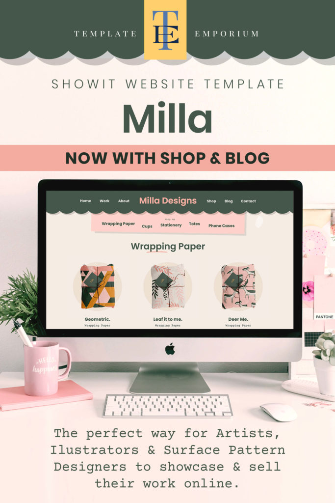
If you liked our Milla One-Pager Showit website template, you’re going to love our latest addition – Milla Multi-Page. It’s the essential premium showit website template because not only is it the perfect way to showcase your work to art directors and clients but, we’ve included a shop, blog and extended About Page.
Let’s see the Milla Multi-Page template in Action!
Want to get started now?
- See a LIVE PREVIEW of Milla Multi-Page
- Ready to purchase Milla? Buy Now
- Need a simpler website & easy set-up shop? Check out Milla’s one-pager template
- After your 14-day free Showit trial
– use our affiliate link to get your first paid month for free!
Index
Milla Multi-Page Showit Website Template Breakdown
What is the Multi-Page Milla Showit Template?
EXCLUSIVE – to the Milla Multi-Page
PLUS… all these Sections found in the Milla One-Pager
How is Milla different from other Website Templates?
A Showit Website Template created with you in mind
As an Artist, Illustrator, or Surface Pattern designer, you need a template that fulfils your particular needs plus is simple to use, update and publish.
What if you could have more time to work on your designs and less time worrying about how to build your website? Well, our premium Milla multi-page website template achieves all of that and more.
Using the Showit website builder, you can update the template using a drag-and-drop method – similar to the tools you may already be using – such as Adobe Illustrator, Indesign etc.
We’ve also designed Milla to strategically meet the needs of your potential clients and art directors.
What you get with your – Milla Multi-Page Showit Website Template
- A quick, scannable site – for time poor Art directors & Clients
- Fully featured shop with navigable sections
- The ability to purchase directly through the shop using Shopify Starter* (Subscription required)
- Matching WordPress-powered blog
- About Section & Page
- Portfolio with pop-up enlargements
- Hidden portfolio pages to keep your best work private
- Contact page
- Privacy Policy Page
Milla Multi-Page Showit Template Breakdown
EXCLUSIVE – to the Milla Multi-Page
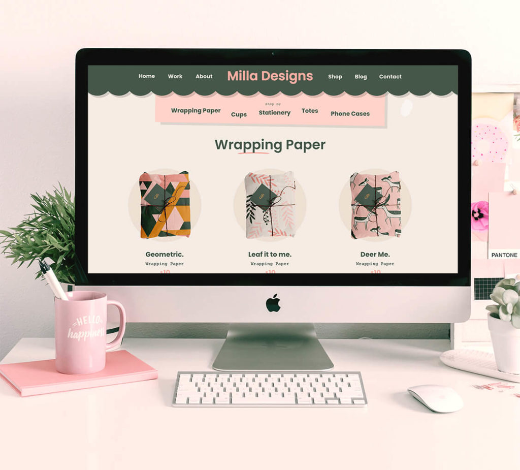
Shop – Sell through your template or Print on Demand service
Blog – A WordPress blog. Includes Blog, Post and Category pages, all perfectly matched to the Milla theme
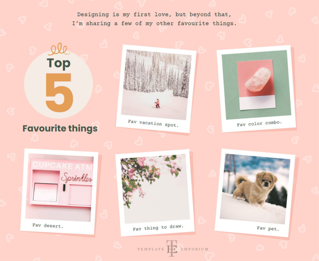
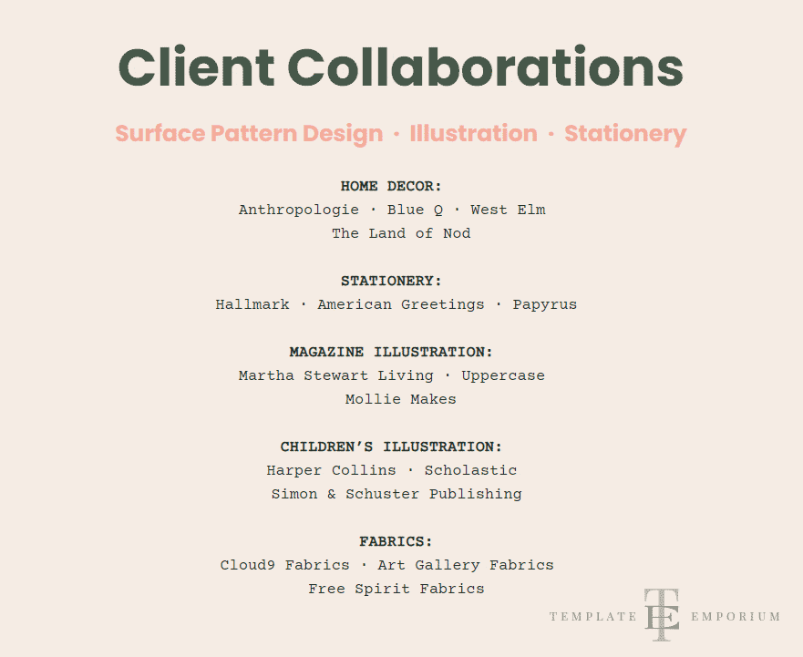
About Page – Dive deeper with an introductory section, Top 5 favourite things and Client Collaborations
PLUS – all these sections from the Milla One-Pager
Introduction – A Slideshow that grabs attention
Selected Work – Art Directors love this layout style!
Hidden Portfolio Page – Custom portfolio pages for Art Directors & Buyers
Dividers – The perfect way to showcase your work
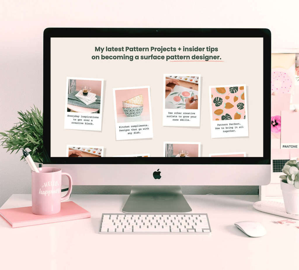
About You – A place to get to know you by animating Polaroid images
Your Clients – Popular company logos included
Email Signup – Grow your list with opt-in
Testimonials – Kind words from your favourite clients
Contact Form & Page – Automatically set up to your Showit email
Instagram Feed – Another way for clients to follow you
Footer – Custom icons & rollover animations
What is the Milla Showit Website Template?
Each section of this mobile-friendly premium template has been designed and structured with you and your potential customers in mind.
We’ve included everything you need and left off any unnecessary bells and whistles that can end up turning potential clients away.
The result is a beautifully clean, easy-to-use (and navigate) website that potential Art Directors and clients will love.
EXCLUSIVE
– to the Milla Multi-Page Showit Template
Shop
Blog
About Page
Shop
This shop gives you two options:
1. Link to your favourite Print on Demand store (Etsy, Society6, minted, etc.) to process shipping and payment.
2. Sell directly through your store with Shopify Starter*.
(Subscription required at an additional $5 USD per month – as of March 2023).
Having all your products in one location (rather than across several POD storefronts) means people get to see more of your work and not be distracted by other artists’ products, as is the case on Shops like Etsy, Society 6 etc.
This means more chance of converting to a sale or purchases of additional items.
Shop Features
Print on Demand Shop Logos

Firstly, we have included some of the most popular print-on-demand logos inside the template, including, Minted, Casetify, Etsy, and Spoonflower.
These P.O.D logos will also change colour to your brand colours. (As shown in the image above). Allowing them to perfectly gell to your brand theme.
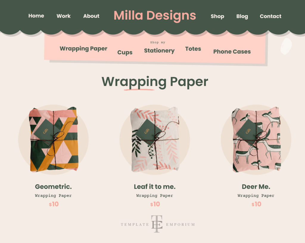
And another bonus is the animated products and hover states draw attention to the Individual Product Pages.
Product Slideshows
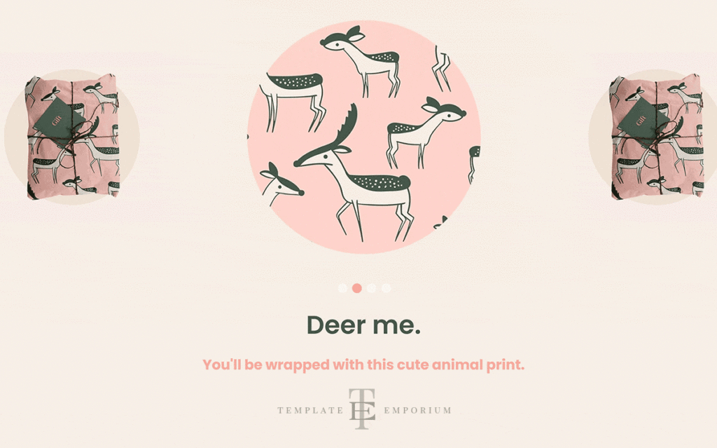
Showcase your work by providing different views – such as an overall view, then zoom in and provide details such as watercolour brush strokes, paper weaves, or hand-embroidered details.
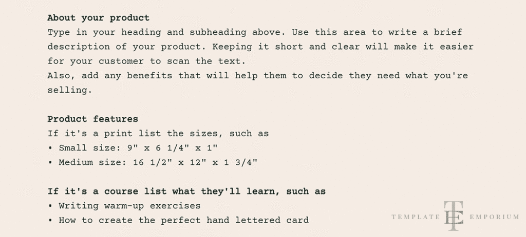
Description Section
We’ve set up the description section with guide text for you to follow, giving you tips on how to list your product and the details to include.
Buy Now Section
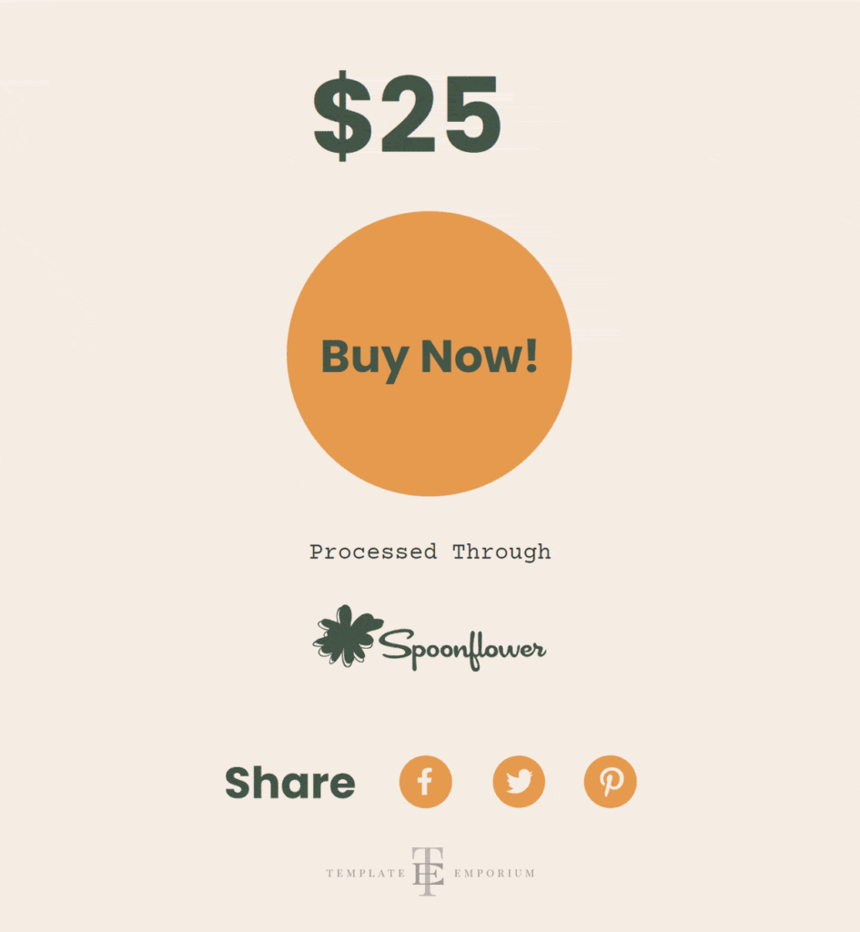
Here you can sell directly through your store or link out to your POD shop and let them take care of the production, billing and shipping.
You can also mix and match depending on your products. For instance, you can sell directly through your template for your handcrafted items while sending people out to several of your POD Stores for other items.
EXCLUSIVE
– to the Milla Multi-Page Showit Template
Blog Features
The Multi-Page Milla Premium Showit template features a matching blog that incorporates the same fun, playful style as the main Site.
Blog Posts
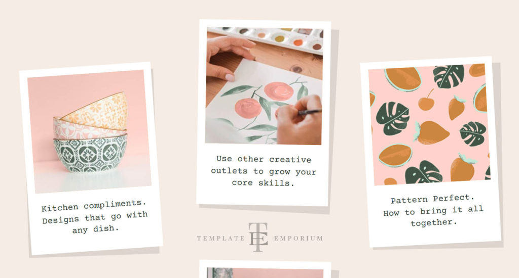
Each blog post represents an individual polaroid.

Easily filter your blog posts by categories, which are updateable to ones that best suit you and your business.
Featured Posts
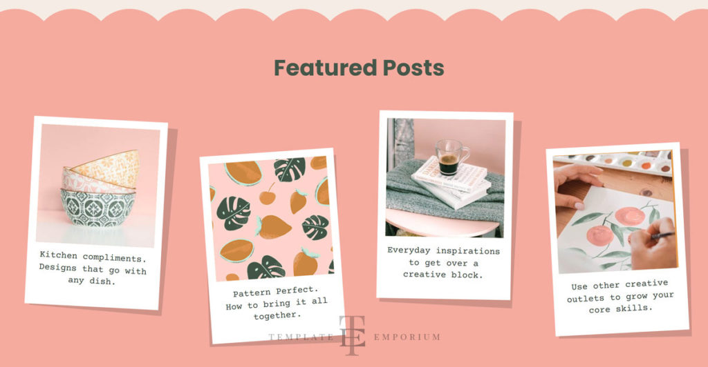
List your top posts here or the ones you wish to promote – E.g. create a post on your winter range.
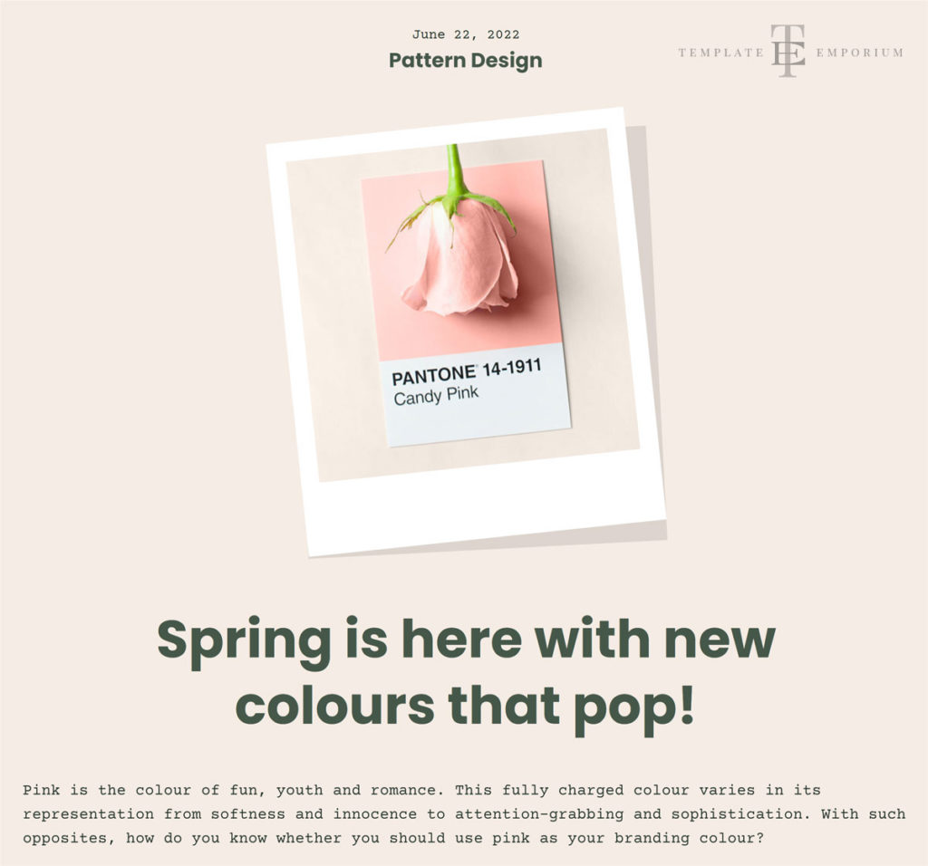
Lastly, your feature image is dropped into a Polaroid to add fun and continue the Milla theme.
Share Post Section
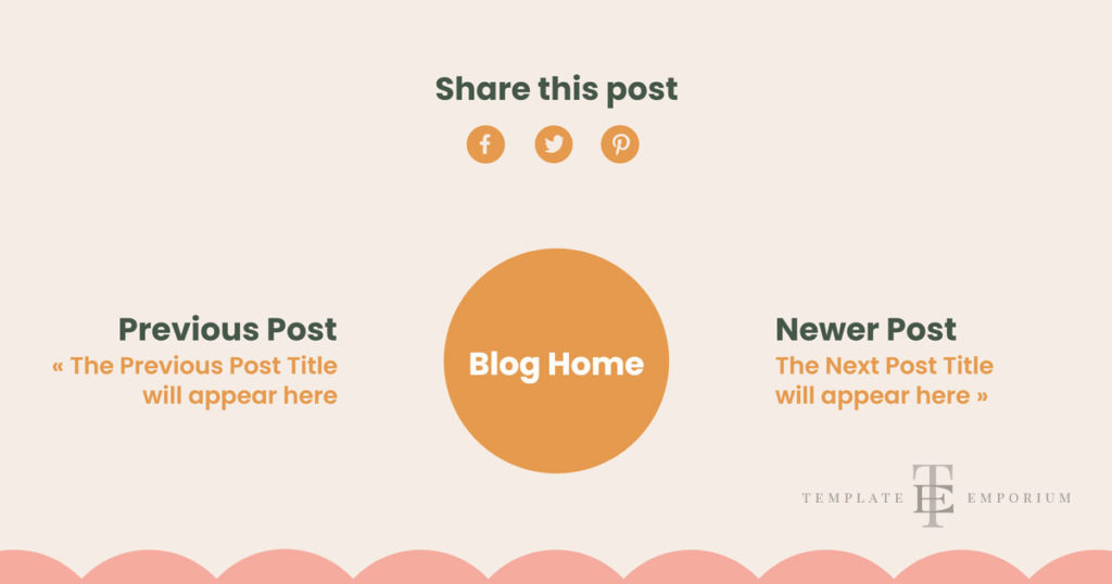
Let viewers share your post on their social networks.
The icon colours automatically update to your brand colours when you add them.
EXCLUSIVE
– to the Milla Multi-Page Showit Template
About Page
When visitors want to learn more about you, they can visit the About Page, which includes the following sections.
Introductory Section
In this section, you can expand on yourself, your background, goals and philosophy.

Top 5 Favourite Things
Secondly, use this section as a fun and engaging way to show people more about what interests you.
Client Collaborations
Finally, think of this part as a place to showcase past projects and clients.
BUY your Milla Multi-Page Template Here!
PLUS – all these Sections
Milla Showit Template Section Breakdown
Introduction
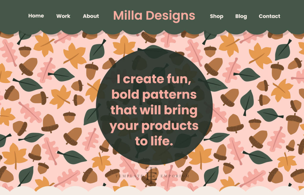
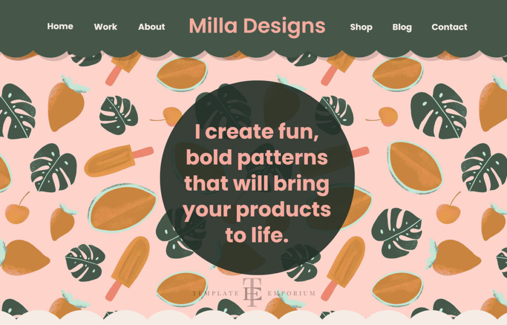
This is the opening slideshow gallery and your tagline.
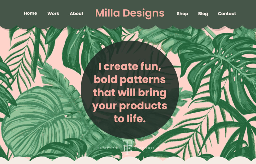
• Grab your ideal client’s attention with your designs as a gallery backdrop.
• And at the same time, explain what you can do for them.
Milla Showit Template Section Breakdown
Selected Work
Here you can showcase your selected work, and latest project or include seasonal pieces of work.
Want to call it something else? No problem, change the title to suit.
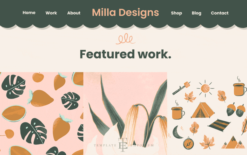
When an Art Director comes to your website to look at your work, they are busy and don’t have time to search. So we created the perfect style gallery.
• Masonry Tiled Style Gallery
Or commonly known as Pinterest Style, creates a gallery that can be quickly scanned by Art Directors, buyers and potential clients.
• A Scannable Site
This is best practice because along with Art Directors, everyone is time-poor and using this layout, makes it easier and quicker to find what they need.

• Close-up enlarged view of your work
Art Directors can get frustrated when they click on a piece they like for a closer view, and nothing happens!
Not with Milla! Click on the piece and, the image becomes full screen giving you a complete close-up, detailed view of the work with no distracting backgrounds.
Milla Showit Template Section Breakdown
Hidden Portfolio (See More Work)
Some potential clients or Art Directors may want to see more of your work, and this section gives them a way to contact you to do exactly that.
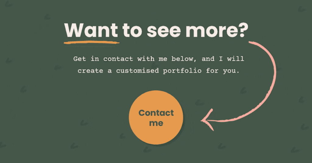
Milla Showit Template Section Breakdown
Dividers
Dividers help break up the content on your website, giving your website clearly defined sections.
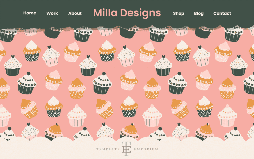
- The divider sections use your artwork as a backdrop, and so double as a showcase for your work.
- A parallax (scrolling background) is applied to your background illustration to make the site even more lively and dynamic.
SHOP for Milla here
Milla Showit Template Section Breakdown
About You
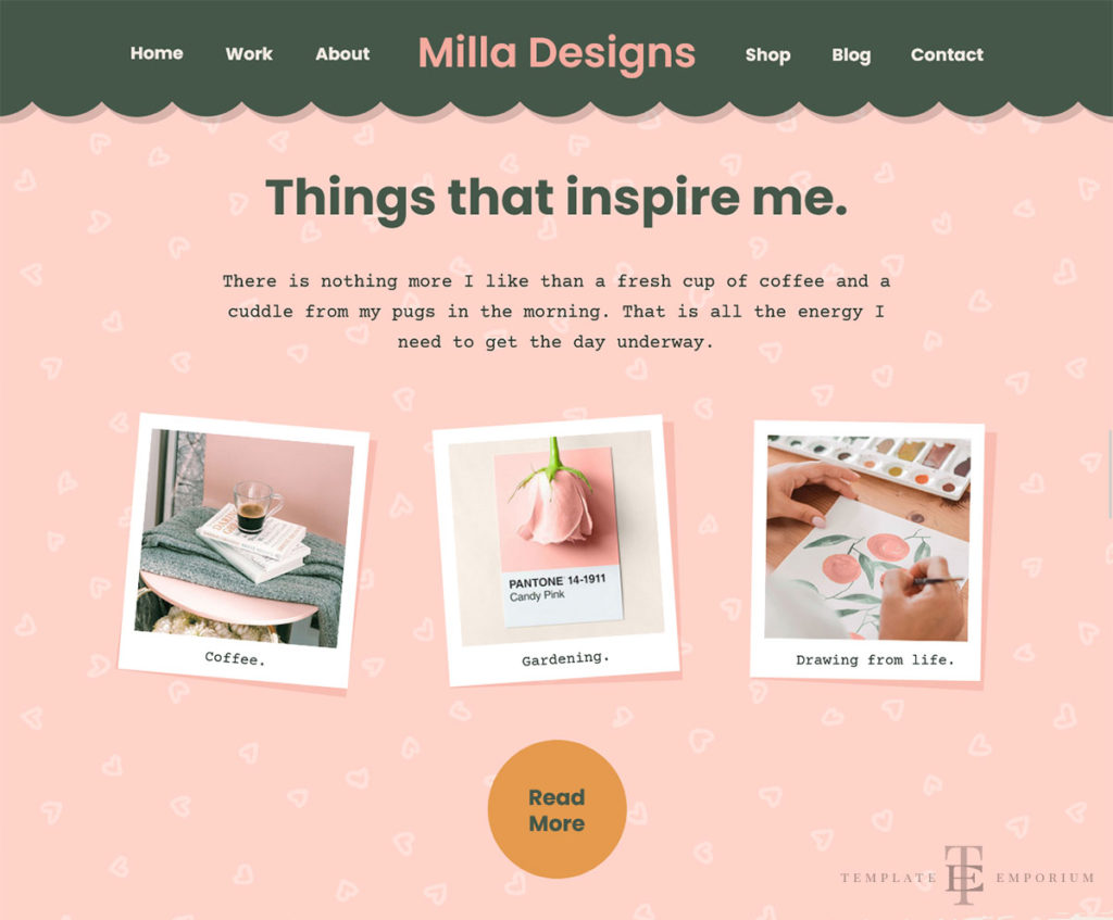
Place an image of yourself, and introductory text here to tell visitors about you.
This section includes custom-designed illustrations that animate to draw attention and create interest. As shown in the image below.
These illustrations will automatically update to reflect your brand colours.
The About section appears on the Homepage and is meant for a quick introduction. It features space for your photo and a quick introductory paragraph.
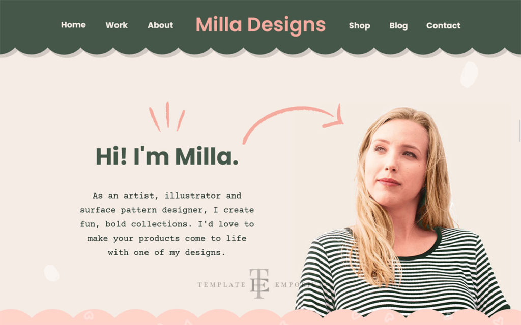
As well as an inspiration section with animated Polaroid images.
Milla Showit Template Section Breakdown
Your Clients
- Showcase your clients here with our included logos of the most popular brands.
- The Client logos will also change colour automatically as you update the template to your brand colours. Or assign your colours to them.
Milla Showit Template Section Breakdown
Email List
Gain followers and clients through an email list.
Simply saying Join my newsletter no longer works. Instead, get people on your mailing list by offering them a helpful incentive download.
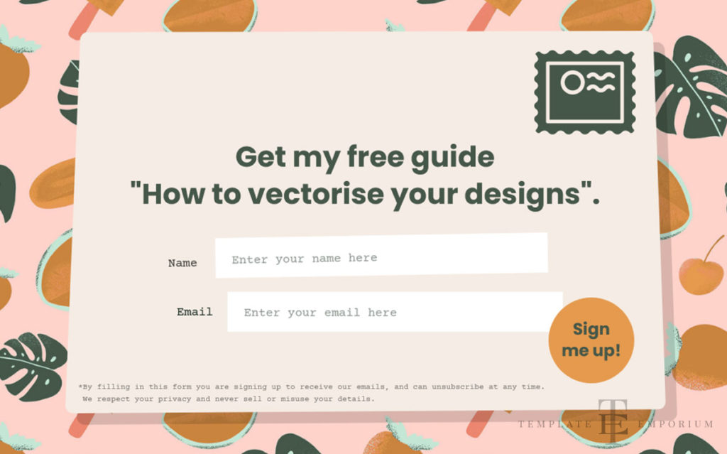
- Features a custom-designed illustrated letter and stamp to make the section fun and vibrant.
- Letter and stamp illustrations automatically update to your brand colours.
Milla Showit Template Section Breakdown
Testimonials
Highlight great feedback and reassure your potential clients.
This section includes space for a headshot, testimonial and company name.

- Easily add or remove the number of testimonials.
- Custom-illustrated arrows and flourishes make it fun to scroll through.
Milla Showit Template Section Breakdown
Contact Form & Contact Page
Make it easy for your potential customers to reach you with this simple-to-use form.
This form will automatically set up to link to the email address you used to sign up to Showit – no complicated setups here!
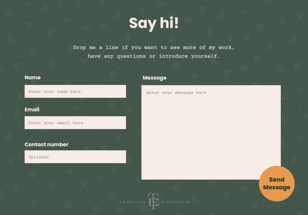
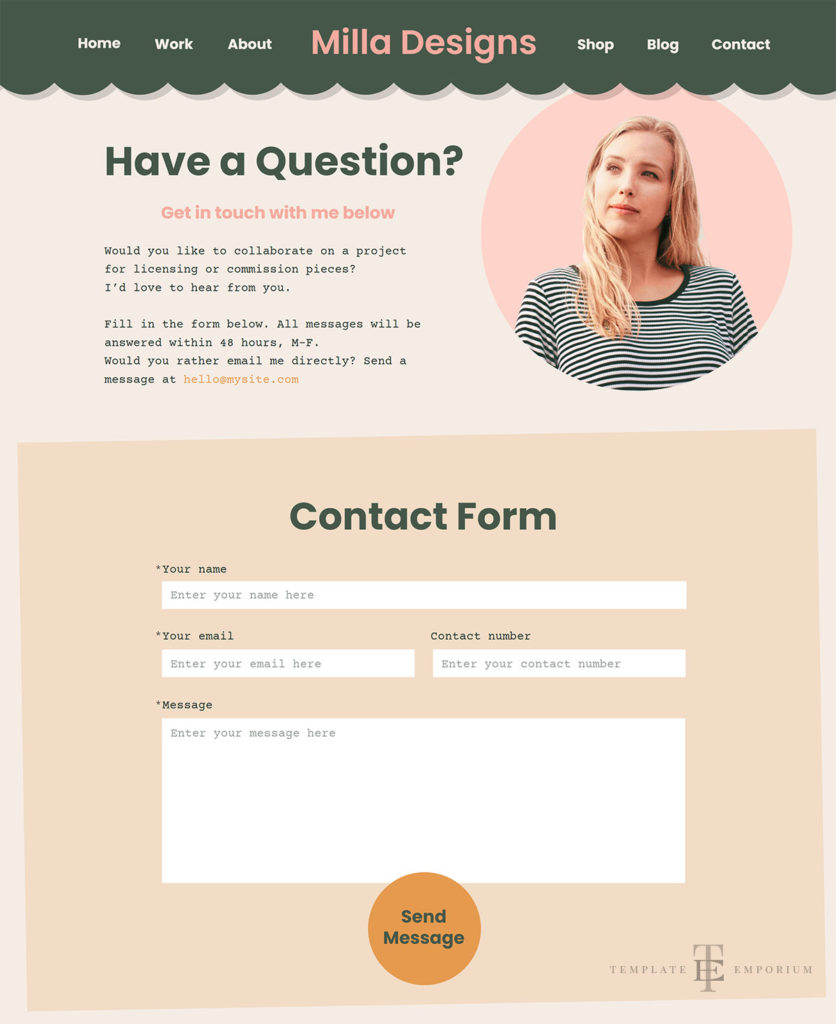
- It also includes a Thank You notification page with space for you to enter turnaround time details.
- This reassures senders knowing their message is on the way and when you will get back to them.
Milla Showit Template Section Breakdown
Instagram Feed
Pulls in images from your Instagram feed and displays them here.

Milla Showit Template Section Breakdown
Footer
Includes custom icons and rollover animations.
How Milla is different from other Website Templates?
1. What Art Directors want
We’ve spoken to busy art directors and clients who told us they want to view a clean, scannable website. And, they want to be able to find what they are looking for quickly.
We strategically designed Milla with this in mind.
2. Customise to your branding
As you enter your brand colours and font styles – the whole website template automatically updates its fonts, colours, logos and icons to match.
3. Custom-designed, hand-drawn illustrations
This collection of illustrations is strategically placed to elevate the overall look and feel. Completely FREE to use or update them with your own. And the illustrated elements will automatically change colour to match.
The collection includes:
Flourishes – swirls and linework.
Shapes – like clouds and rough paper.
Navigation items – such as arrows and pointers.
Background elements – paint dabs and patterns.
Note that the main, large illustrations on the website will not update their colours – these are meant to be replaced with your artwork.
4. All images & Copy included
Unlike other website templates, every inspirational photo, illustration and, strategically written heading and body text comes with your purchase. Use these elements as a guide or as content for your site.
BUY your Milla Multi-Page Template Now.
Action Steps
- Check out the Milla Multi-Page Showit Template for yourself.
- Email us with any questions you have.
- Purchase Milla & get started on our free step-by-step training series to turn the template into your dream website.
- Grab your FREE first paid month of Showit using our link below.
After your 14-day free Showit trial – get an additional paid month for free!
Ready to start creating your website with Showit? Hit the button below and get your first subscription month for free.
Full disclosure, this is our affiliate link. So if you join Showit, you’ll be supporting us which helps us produce more content like this, at no additional cost to you.
Want to see more Showit Templates for Creatives?
- Fun and Vibrant Showit Template for Artists & Illustrators.
- Surface Pattern Designer Website Template.
- Black & White Photography Website Template.
- Destination Photographer Website Template.
Like the Blog Post?
PIN IT FOR LATER. And for more helpful tips follow us on PINTEREST.
Search
Create & launch your website in a
few simple steps
FREE GUIDE
While you’re here,
grab our FREE
‘Do’s & Don’ts of what to add to your website’ Guide.
‘Do’s & Don’ts of what to add to your website’ Guide.
When you sign up, we’ll send you
emails with additional helpful content.
About Lavinia & Tom
Hi, we're so glad you found us.
We love helping creatives like you finally have the website you’ve always wanted.
Blog Categories
Follow us
