grab our FREE
‘Do’s & Don’ts of what to add to your website’ Guide.
‘Do’s & Don’ts of what to add to your website’ Guide.
emails with additional helpful content.
Hi, we're so glad you found us.
We love helping creatives like you finally have the website you’ve always wanted.
few simple steps
Follow us
The Simple Colour Rule to Make Your Website Look Amazing!
Now you know what the 60/30/10 Colour Rule is and how to use it with your Branding Colours (we covered all of that in Part 1 – click here to catch up), in the final part of this series, we’ll show you how to apply this website Colour Rule to your own website to achieve amazing results.

Index
The Simple Colour Rule to Make Your Website Look Amazing!
PART 2
How to Apply the Colour Rule to Your Website
Breaking Down the Rule
Insider Tip 1 – Change Up Your Colours Between Sections
Insider Tip 2 – Want a Section to Really Stand Out?
Want to see a Live Example?
How to Apply the Colour Rule to Your Website
Now you have your ratios calculated, (part 1 of this series will show you how) it’s time to put it into action.
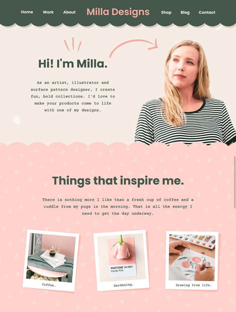
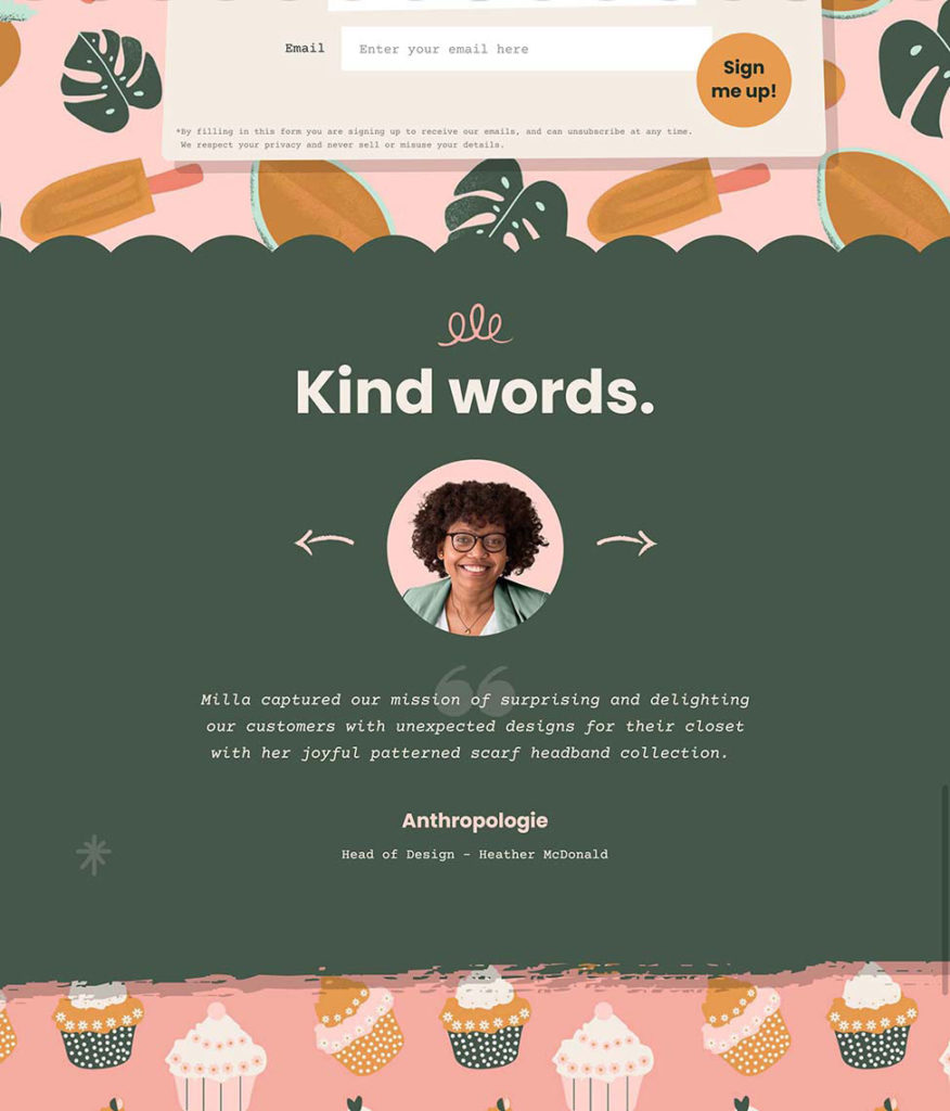
Watch the animated movie below to see how we applied these to the “Milla” Showit Website Template.
Breaking Down the Rule
60% website colour rule
In the movie example above, the Main / Neutral colours – covered 60% of our website elements.
When you look at a website, you will notice the majority of the website is actually the background or page colour of your website.
So, let’s apply the 60% Main / Neutral colours to the background elements.
30% website colour rule
Next, for the 30% Secondary Colours, this will fill in the main website content.
This could include text, smaller sections like the menu bar, and graphic elements that you may have on your page. (Don’t include buttons though, that comes next).
10% website colour rule
Finally, the last 10% is for our Accent Colours. They include elements like Buttons and Links.
These colours draw attention and get the viewer of your website to take action.
Insider Tip 1 – Change Up Your Colours Between Sections
Part of a good website design is letting your visitors know what content is related to each other.
A simple way to do this is to group your content into sections. E.g. Welcome section, About section, Portfolio section.
And an easy way to separate sections is to give each section a different background colour. In our example below – we have 2 Main / Neutral colours – cream and light pink.
These coloured sections make the look and flow of your website easy to understand.

Insider Tip 2 – Want a Section to Really Stand Out?
For a section to stand out, you want to break the repeating background elements.
You can do this by swapping out your Neutral colour / Main colour for your Secondary colour (or even the accent colour if you really wanted to draw attention!)
In the image below, we have swapped the Secondary Colour with the Main / Neutral Colour.
Note that we also had to change the text colour to ensure it was still readable.

Want to see a Live Example?
Check out our Milla Showit Website Template to see the branding colours in action.
You Did it!
That’s a wrap on Part 2 – The Simple Colour Rule to Make Your Website Look Amazing! of this two-part Colour Rule series.
Now you know all about the insider 60/30/10 Colour Rule and how to apply it to your website, let us know how you put this rule to use. And in the meantime, Follow us on Pinterest for more blog posts like this.
Where to Now?
- Missed Part One of this Colour Rule Series? Catch up here.
- How to Choose Your Brand Colours This blog & Free Guide will help!
- Try out our 50 Autumn Colour Combinations here.
Want more Colour Tips?
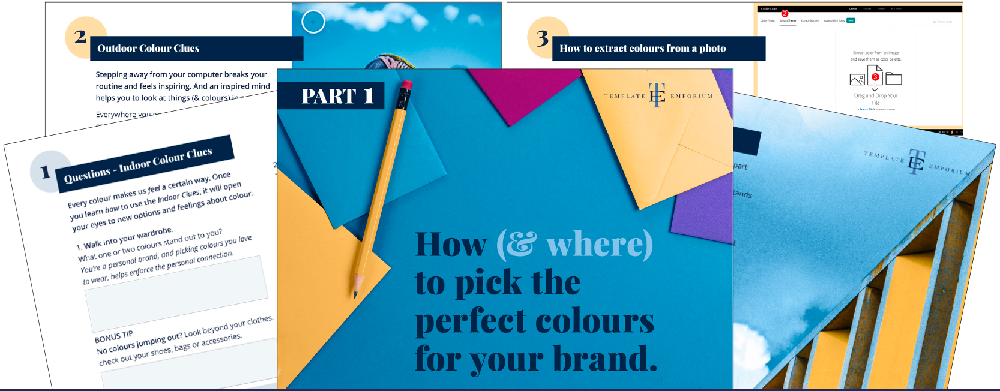
Grab our FREE GUIDE – How (& where) to pick the perfect colours for your brand.
Do you struggle when it comes to picking a colour palette for your business? In this 2-Part Training Guide, you’ll learn three ways to use colour clues (that are already around you), to ensure you pick the perfect palette every time!

Like the Blog Post?
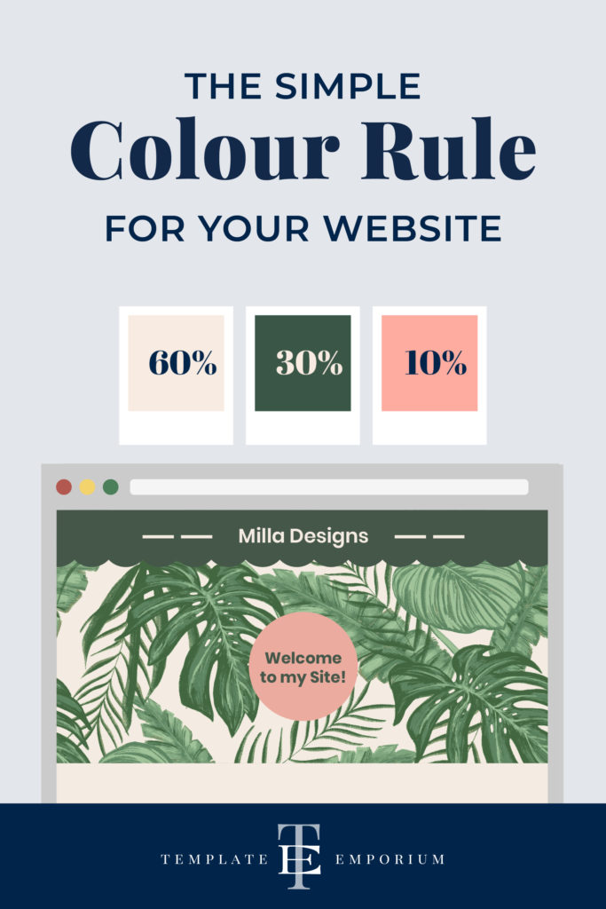
PIN IT FOR LATER. And for more helpful tips follow us on PINTEREST.

Search
Create & launch your website in a
few simple steps
FREE GUIDE
While you’re here,
grab our FREE
‘Do’s & Don’ts of what to add to your website’ Guide.
‘Do’s & Don’ts of what to add to your website’ Guide.
When you sign up, we’ll send you
emails with additional helpful content.
About Lavinia & Tom
Hi, we're so glad you found us.
We love helping creatives like you finally have the website you’ve always wanted.
Blog Categories
Follow us