grab our FREE
‘Do’s & Don’ts of what to add to your website’ Guide.
‘Do’s & Don’ts of what to add to your website’ Guide.
emails with additional helpful content.
Hi, we're so glad you found us.
We love helping creatives like you finally have the website you’ve always wanted.
few simple steps
Follow us
Should you use Green as your Branding Colour?
Green is the colour of nature and is around us every day. On one end, it can make you feel optimistic and compassionate. It is, however, also associated with feelings of greed and jealousy. With such extremes how, do you know whether you should use green as your branding colour?
We have developed a three-part system that takes a deep dive into Green’s meaning, varieties and how to use this information in your branding.
Let’s go green and discover whether it’s right for you.
Before we start – missed a part of our Branding Colour Series? Catch up below.
- 1. Should you use Blue as your Branding Colour?
- 2. Should you use Red as your Branding Colour?
- 3. Should you use Yellow as your Branding Colour?
- 4. Should you use Green as your Branding Colour? (this is the blog you’re reading)
- 5. Should you use Pink as your Branding Colour?
- 6. Should you use Orange as your Branding Colour?
- 7. Should you use Purple as your Branding Colour?
- 8. Should you use Grey as your Branding Colour?
- 9. Should you use White as your Branding Colour?
- 10. Should you use Black as your Branding Colour?
- 11. Should you use Beige as your Branding Colour?
- 12. Should you use Brown as your Branding Colour?
Want to start using Green as your Branding Colour now?
Download our FREE Guide
Here’s What We’ll Cover
MEANING OF GREEN
The Psychological Meaning of Green
Meaning of Green to you
Green in Business
VARIETIES OF GREEN
Apple Green to Kelly Green, we share our favourite Greens
Green & The Colour Wheel
Colours that go with Green
GREEN IN BRANDING
Matching to the Tone of your Business
Picking the Perfect Palette with Green
When not to use Green in your Branding
Should you use Green as your Branding Colour?
1. Meaning of Green
The Psychological Meaning
Being the colour most inspired by nature, green is part of our everyday lives. From the trees, plants and grass, we pass to the green traffic light that ensures us it’s safe to go. Being surrounded by it creates a soothing, modern and fresh feel.
But like most colours, there are also conflicting meanings of what green represents. It can also vary from feelings of greed and jealousy to compassion and optimism.
We believe it is based more on the shade of green rather than the colour itself. And to make it a little easier, we’ve created an icon guide below and broken it into Light, Bright and Dark Green.
Original unedited icons from the Noun Project
Light Green Meaning

Bright Green Meaning

Dark Green Meaning

Want a Green Branded Website?
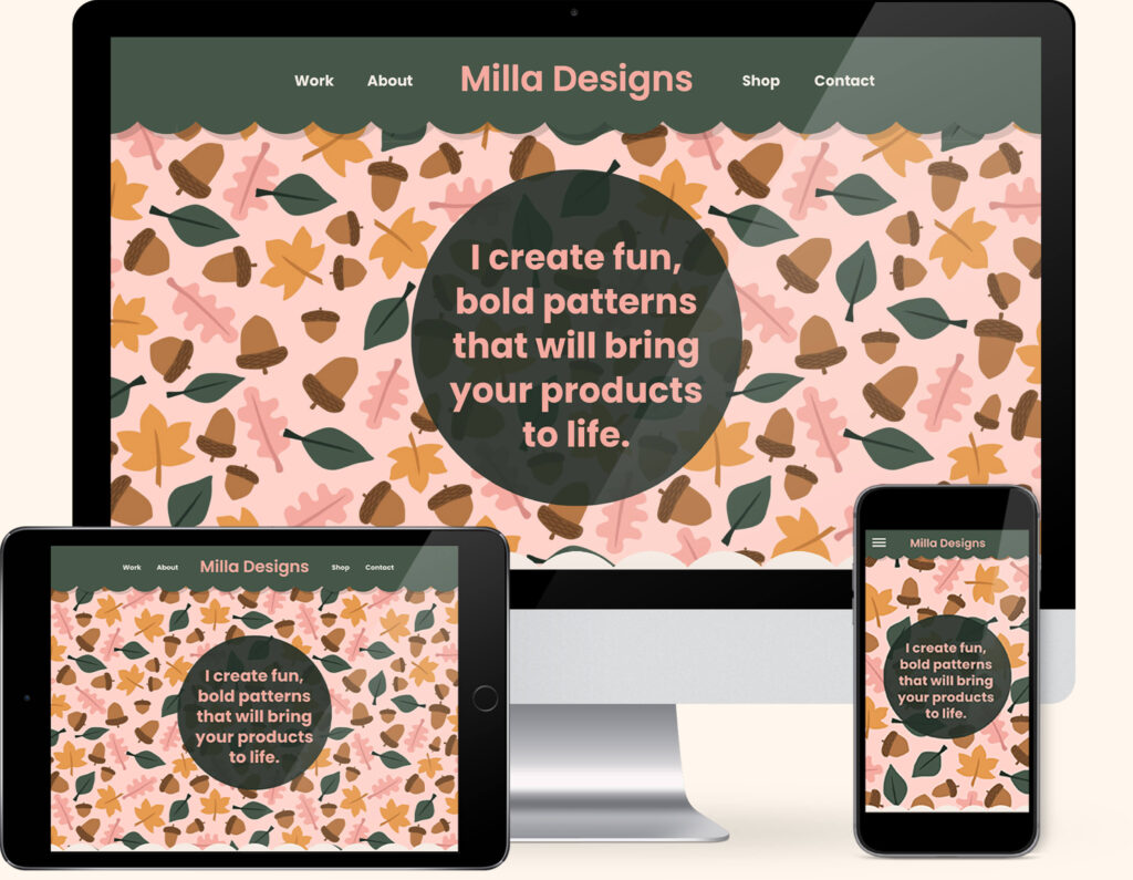
If you love Green, we have the perfect website template for you. Our “Milla” template combines everyone’s favourite pairing of Green and Pink to create the ultimate Green lover’s website.
Created exclusively for the Showit platform, now you can showcase your collection of designs alongside your favourite colour.
Meaning of Green to You
How do you feel about Green? Is it a colour you would like to incorporate into your branding, or are you not convinced it could work for you? Read on to learn more.
Any experiences or memories you’ve had with Green will help determine how you feel about it.
Maybe it reminds you of happy childhood memories of your favourite muppet Kermit or the original way to get slimed on TV! Or maybe you’re like one of my old work colleagues who would never let us use green in our design concepts because it reminded her of her school uniform!
If you’re a personal brand, the key is to find a balance between the colours you like and the ones that will attract your ideal client.
Look at the icons above and pick which words sum up the way you feel about Green. Or the way you want your business to be perceived. Doing this will be a great way to determine the shade of Green that’s right for you.
Colour Clues
Every colour makes us feel a certain way. Once you learn how to use the Indoor Clues, it will open your eyes to new options and feelings about colour.
We have introduced green into our home in the way of indoor plants. The green feels soothing and calming especially, in our office area. And the green in the prints on our wall and our cushions seem to anchor the other colours together. These are all Colour Clues to determine how you feel about a particular colour.
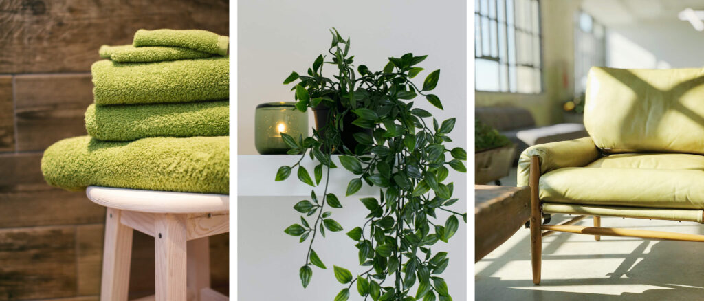
Would your ideal client like Green, how would it make them feel?
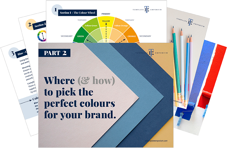
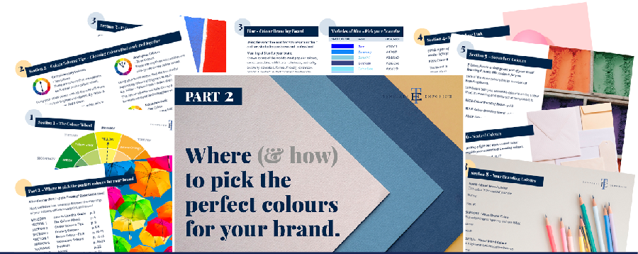
In Part 1 of our Colour Guide series “How (& where) to pick the perfect colours for your brand.” we explain everything about Colour Clues. Click here to download it – it will be super helpful.
Green in Business
Disney
Disneyworld wins the prize for incorporating green in their business by creating their unique shade called “go away green”, used primarily as camouflage.
Any building at their resorts or parks that they don’t want guests to look at (such as construction areas or the back of rides) they paint “go away green”, so you don’t look at it, and instead, your eyes focus on the buildings or rides that sit in front of it.
Plus, it will blend in with the surrounding trees and foliage, making the building suddenly disappear before our eyes – just like Disney magic!
Beverage Companies
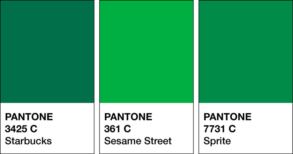
Representing a feeling of crispness and refresh, green has been a popular choice in this industry. Here are a few green beverage branding examples.
Sprite
Mountain Dew
Perrier Mineral Water
And even warm beverage companies such as Starbucks use green in their branding.
According to Starbucks Creative Expression, Green and Starbucks are iconic and their most identifiable asset. We’re leaning into a family of greens to leverage brand recognition. Fresh and inviting, this expanded palette nods subtly to our heritage and propels us into a global future. We always ensure a presence of brand greens, either within the composition or through the presence of a logo.
Photos below from Pexels.

Environmental
Because green represents nature, growth and harmony, companies that use organic products stand for the environment or are seen as “green” organisations, using the colour green in their branding is a perfect match.
Australia Zoo
Wholefoods
The Body Shop
Should you use Green as your Branding Colour?
2. Varieties of Green
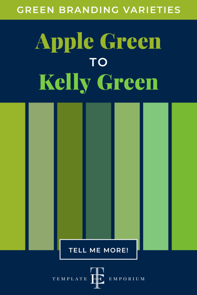
Apple Green to Kelly Green, we share our favourite Greens
Green is both a COOL & Secondary colour. It’s made by mixing two primary colours (Blue + Yellow) together. These primaries (Blue & Yellow) appear on either side of Green on the colour wheel.
Many varieties of Green may look similar to each other but have different names. From light to dark Green we’ve compiled a cheat sheet of our favourites below (and included a few you may have never heard of!).
And to make it easy, we added the hex numbers. So you can start using them in your branding today.
Press play on the image below or get all the colour breakdowns in our FREE Guide.
Insider Tips
To make Green, mix Blue and Yellow.
Tints of Green = Lighter varieties reflect the fun and youthful audience. It feels more approachable and friendly. Such as Pistachio and Chartreuse.
Shades of Green = Darker varieties attract a more mature audience. If your business is more traditional, a deeper green such as Avocado and Racing Green is a safer option.
Green & The Colour Wheel
One of the questions we often get asked is What colours go together? And the best way to ensure you always get it right is to use the Colour Wheel.
There are 12 hues (colours) on the wheel and consist of:
1. Primary
2. Secondary
3. Tertiary
In this post, we’re focussing on Green which, is a Secondary Colour.
Want Your Own Colour Wheel? Get it now in our FREE Guide
Green & Monochromatic

- Monochromatic refers to using one colour only.
- Take your one MAIN colour Green and add in light and dark variations.
Using one hue (Green) and adding increasing amounts of:
1. White creates a tint of Green. E.g. Mint.
2. Grey creates a tone of Green. E.g. Sage.
3. Black creates a shade of Green. E.g. Forest Green.
Green & Complimentary Colours
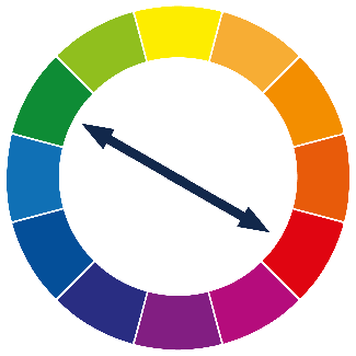
- Complimentary refers to the use of two colours.
- These are colours that are opposite each other on the colour wheel.
- When used together, they bring out the best in each other.
Using your MAIN colour Green, with its opposite Red, will create contrast and make the colours look brighter and more vibrant.
Insider Tip
Use the Complimentary Colour Red in small amounts, making it more of a pop of added colour or an accent.
To avoid them overpowering each other, mix in tints, tones and shades.
Using a lighter shade of Red means it will fade back. Allowing the Green to come forward.
Green & Analogous Colours

- Analogous refers to the use of three colours.
- These are any three colours that are side-by-side on the colour wheel. Think of them as colour neighbours.
Using your MAIN colour Green, find the two similar supporting colours sitting next to each other.
The undertones of these colours, Yellow-Green + Blue-Green, are similar. Which helps convey a low-contrast, friendly, harmonious mood and will appear easier on the eye.
Green & Split Complimentary Colours

- Split Complimentary is the use of two colours.
- This is using a base colour and the two colours on each side of its complement.
When your MAIN colour is Green, its complementary colour is Red. The two colours on each side of the red are Blue-Orange and Red-Purple.
A combination like this creates a low-contrast palette of Analogous colours. And the opposite colour gives a pop of colour.
Insider Tip
This time, we’re going to do the opposite of what we did with the complementary colour palette. Now the MAIN colour Green is used as the Accent.
Colours that go with Green
From the grass you walk across to the trees swaying in the breeze while you carry your cup of coffee (with that famous green logo emblazed across the front of it), green welcomes us day in and out. It’s also universally known as the colour which means it is safe to go!
For colours as welcoming as green, how do we make it work well with other colours?
Blending Greens

As discussed earlier, a monochromatic palette refers to using one colour.
We love combining Green with Green because not only does it elevate the look, but the multiple shades of Green create harmony together.
Try adding Light and Dark variations together.
The lighter shade will soften, while the darker one will be the highlight.
Green Colour Combinations

Green & Red
If we refer back to our colour wheel example, these colours complement each other perfectly.
Pistachio + Burgundy
Granny Smith Apple Green + Apple Red
Leaf Green + Poppy Red
Olive Green + Red
Mint Green + Tomato Red
Green & Grey
Using a neutral colour like grey allows Green to really pop
Jade + Grey
Pistachio + Grey-Blue
Pale Green + Grey-Green
Lime Green + Slade Grey
Sea Green + Silver-Grey
Green & Blue
Being colour neighbours on the colour wheel means this combination work well together.
Deep Green + Indigo
Key Lime Green + Ocean Blue
Seafoam Green + Blue-grey
Emerald Green + Sky Blue
Verdant Green + Coastal Blue
Green & Pink
Being a shade of Red, Pink and Green is a beautiful complementary combination.
Kelly Green + Magenta
Spring Green + Hot Pink
Sage Green + Beetroot
Emerald Green + Blush
Pastel Green + Pastel Pink
Green & Brown
Another neutral colour that works well with Green.
Fir Green + Copper
Artichoke Green + Dark Oak
Emerald Green + Cognac
Chartreuse + Dark Brown
Army Green + Tan
Green & Yellow
Spring Green + Citron
Dark Green + Neon Yellow
Olive + Yellow
Khaki + Mustard Yellow
Iridescent Green + Bright Yellow
Want more Green colour combination ideas? Click the image below.
Should you use Green as your Branding Colour?
3. Green in Branding

Matching to the Tone of Your Business
As discussed earlier, we break Green into three options, light, bright and dark. Use this as a guide to help you pick the right shade of Green for your branding.
Light Green
Cheerfulness, dependability, energy, friendliness, healing, hope, kindness, liveliness, loyalty, relaxation, resurrection, soothing, spirituality, success, and vitality.
Bright Green
Creativity, freshness, growth, happiness, joy, life, nature, new, organic, peace, positivity, prosperity, renewal, sustainability, and youth.
Dark Green
Balance, compassion, environment, generosity, harmony, health, luck, maturity, nature, prestige, prosperity, reliability, safety, stability, and wealth.
Picking the Perfect Palette with Green
Our 5-step Perfect Palette Process
Need help to choose your Brand Colour Palette? We’ve created a simple step-by-step process.
Grab our free guide as a handy download.
Step 1
Pick the Main Brand Colour
So you’ve picked green. Now you have to decide on the type of green, is it light, bright or dark?
Step 2
Pick a Support Brand Colour
If you feel stuck at this stage, just remember this colour creates harmony with the MAIN. Refer back to our tips earlier on Green & The Colour Wheel and Colours that go with Green to help you decide.
Step 3
Pick a Light Neutral Brand Colour
Why do you need neutrals in your brand colour palette? Because it creates balance.
Not sure which neutrals to pick? Go to page 16 of our free guide.
Step 4
Pick a Dark Neutral Brand Colour
Your light neutral colour needs a partner. So now it’s time to pick a dark neutral colour for even more balance.
Our guide on page 16 explains everything.
Step 5
Pick an Accent Colour
This colour is used to make something on your website pop. Therefore it’s only used sparingly.
Page 22 of our free guide will explain more.
Web and Print Branding
Once you have picked the right Green for your business, add the hex code to your website.
View how it looks on both desktop and mobile. To create consistency only, use the one hex code number to ensure the Green you chose is always the correct shade.
For print, instead of a hex code, you will need the CMYK (Cyan, Magenta, Yellow & Black) or Pantone, colour breakdown to ensure the Green will print out the way you want.
When not to use Green in your Branding
Brand Colour Palette
When it comes to creating a brand colour palette, and you decide to use Red as your support colour to Green, be careful the combination doesn’t become too “Christmasy”. Red and Green will always be associated with this time of the year. And to avoid this, it comes down to the shade of the colours you pick.
Refer to Green Colour Combinations for our tips.
You Did it!
That’s a wrap on Should you use Green as your Branding Colour?
How do you feel about Green now? Are you excited to try it with your branding? Let us know. And in the meantime, follow us on Pinterest for more blog posts like this.
Where to now?
- Want to try the brightest of all colours Yellow? This blog is for you.
- Which Colour should you use for your Branding?
- What other colours would suit your branding? Download our guide.
Don’t forget to download our FREE Colour Guide.

Like the Blog Post?
PIN IT FOR LATER. And for more helpful tips follow us on PINTEREST.
Search
Create & launch your website in a
few simple steps
FREE GUIDE
While you’re here,
grab our FREE
‘Do’s & Don’ts of what to add to your website’ Guide.
‘Do’s & Don’ts of what to add to your website’ Guide.
When you sign up, we’ll send you
emails with additional helpful content.
About Lavinia & Tom
Hi, we're so glad you found us.
We love helping creatives like you finally have the website you’ve always wanted.
Blog Categories
Follow us
