grab our FREE
‘Do’s & Don’ts of what to add to your website’ Guide.
‘Do’s & Don’ts of what to add to your website’ Guide.
emails with additional helpful content.
Hi, we're so glad you found us.
We love helping creatives like you finally have the website you’ve always wanted.
few simple steps
Follow us
Website Branding: How to use your Brand Colours to make your site Pop!
With this website branding secret, your site is sure to stand out! And the majority of your competition, aren’t even aware of how to do it.
In this final 2nd part of the series, we’ll show you how to take the branding of your website one step further to make it really pop!
In Part 1, we looked at how your Signature Logo can lift your Website from being great to Amazing! Plus we shared our 3-step Process, on how to make it happen.
If you missed Part 1, catch up here.
Part 2: Enhancing your Images using your Brand Colours
We know how hard you have worked to put your website together and launch it to the world. But with a sea of similar businesses all doing the same thing, how do you stand out?
Website Branding
The secret is all in the final 5% of polish.
Enhancing your Images using your Brand Colours is the best-kept secret around.
But don’t worry you, don’t have to do a thing! Leave it all to us as we Enhance, then Colour Grade your photos to match your Brand Colours.
If you are unfamiliar with Photo Enhancement and colour Grading, you are not alone. (Don’t worry we will explain everything.)
But the impact it will make on your website branding will take your site to a whole new level of professionalism.
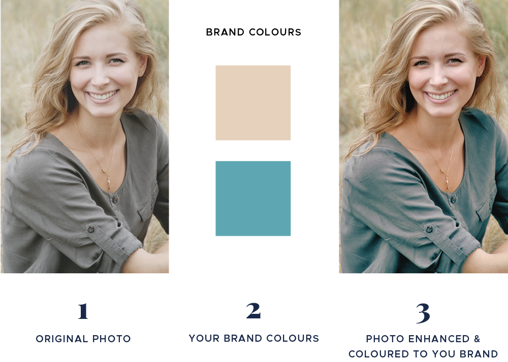
What is Photo Enhancement?
It includes finding and bringing out the tones, shadows and highlights in a photo.
In doing this, you take an average-looking image and bring life to it. And the flat, dull photo you started with now has a professional-looking edge.
We have worked on enhancing images for various organizations for years. From major media companies, advertising agencies and solo businesses, we have come across everything.
And after lots of trial and error, we have developed our secret sauce to ensure your photos will look their absolute best.
What is Colour Grading for your brand colours?
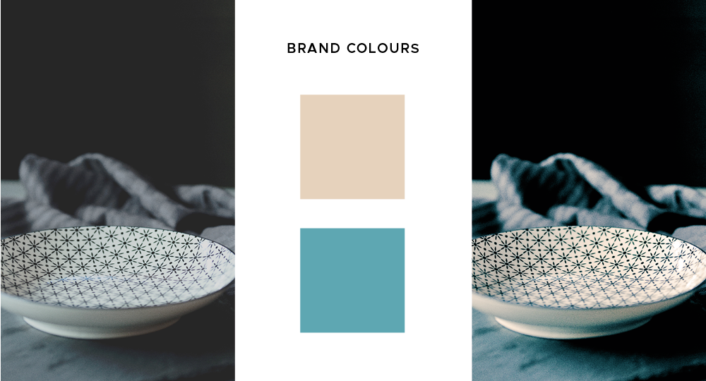
Colour Grading is changing the colour tones of your photo.
We take that one step further by incorporating two of your brand colours into the tones of your Enhanced Photo.
When applied, the colour tones have now changed, and, you can see your branding colours reflected in the final photo.
Brand Colourised Photos gell perfectly with the rest of your website, making it look like a cohesive piece.
They provide an extra level of polish, to make your website stand out from the competition.
After experimenting with this process for years, we are now sharing this technique so you too can enjoy the impact it will make on your website.
How to order your Photo Enhancements
Your order includes BOTH enhancement and colour grading to your brand colours.
Step 1 – Buy your Photo Enhancements
- Choose a 5-photo pack
- Choose a 10-photo pack and receive one FREE enhancement
- Select numerous amounts of photo packs and add them to the cart
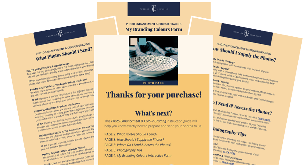
Step 2 – PDF Guide and Form
On purchase, you’ll get a PDF guide outlining the best way to shoot and supply us with the images to ensure you obtain the best results possible.
You will also receive a link guiding you to where you should upload your images so we can access them.
If your images are not of a high enough quality, or if the colour shift for brand colouring is too great we’ll let you know by email.
Step 3 – Brand Coloured Photos
Leave the rest to us. We’ll enhance and colour your images then send back your new branded photos.
Order your Photo Enhancements HERE
See it in Action
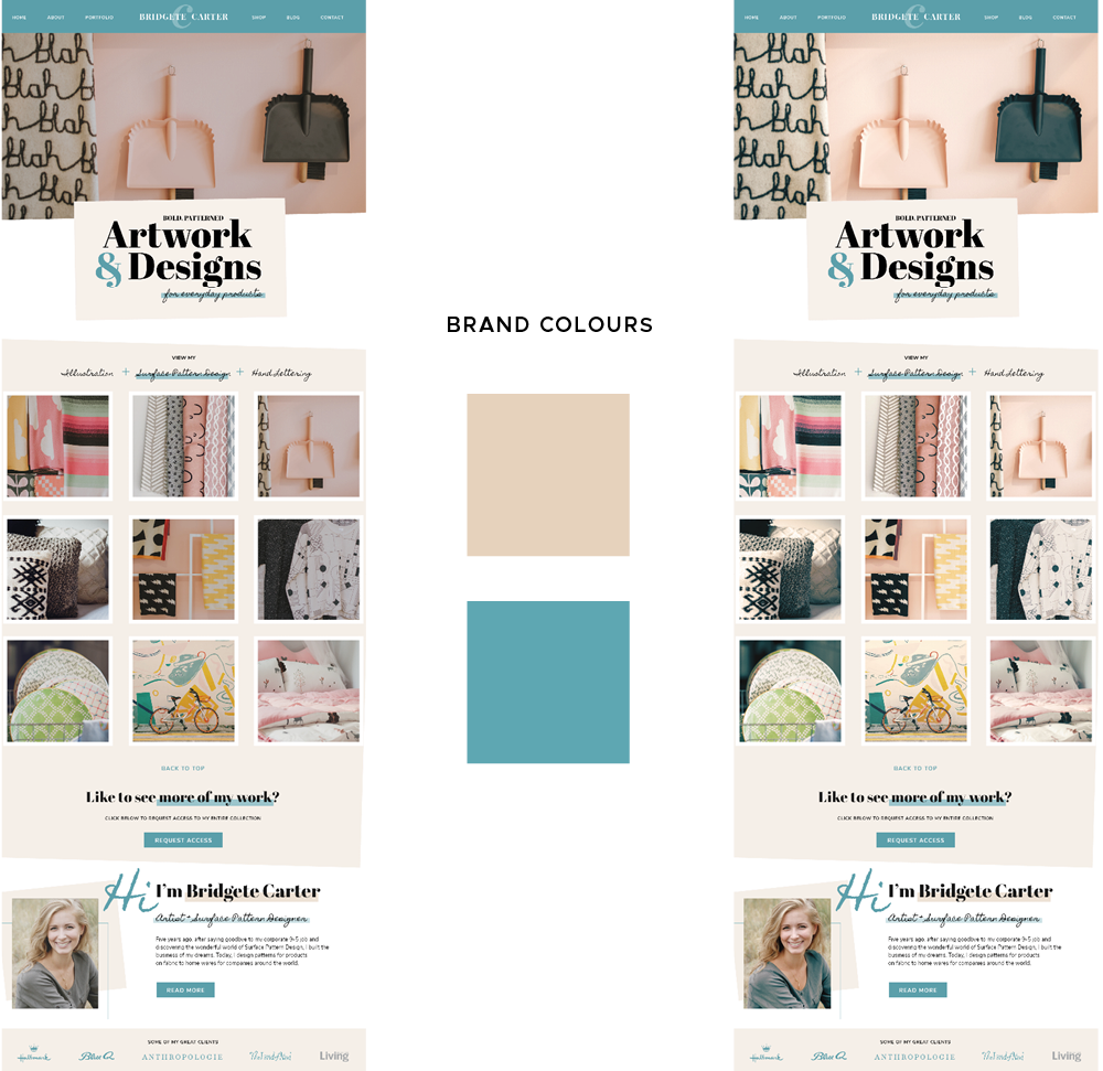
We used this exact method on all the images for our website template – Artwork & Designs (created exclusively for Surface Pattern Designers and Illustrators).
See the completed website branding project and Enhanced Images here.
Your Action Steps
- Order your Photo Enhancements HERE
Where to next?
Part 1 – Lift your website from great to Amazing Show Me How
3 Questions to Ask Before You Begin Your Visual Branding Tell Me
What is a signature style and, do I (really) need it? Find Out Now
Want more Colour Tips?
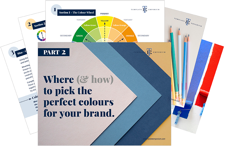
We’ve created a simple step-by-step process to help you choose your Brand Colour Palette.
Grab our FREE GUIDE HERE.
Like this Blog Post?
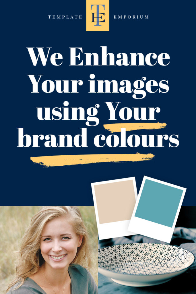
PIN IT FOR LATER. And for more helpful tips follow us on PINTEREST.
Search
Create & launch your website in a
few simple steps
FREE GUIDE
While you’re here,
grab our FREE
‘Do’s & Don’ts of what to add to your website’ Guide.
‘Do’s & Don’ts of what to add to your website’ Guide.
When you sign up, we’ll send you
emails with additional helpful content.
About Lavinia & Tom
Hi, we're so glad you found us.
We love helping creatives like you finally have the website you’ve always wanted.
Blog Categories
Follow us