grab our FREE
‘Do’s & Don’ts of what to add to your website’ Guide.
‘Do’s & Don’ts of what to add to your website’ Guide.
emails with additional helpful content.
Hi, we're so glad you found us.
We love helping creatives like you finally have the website you’ve always wanted.
few simple steps
Follow us
3 tips for creating your first (unique) logo
There’s a type of logo that only you can create. This one-of-a-kind logo will be unique to you. And I’m going to share with you the 3 tips for creating it.
I’ll also let you in on an insider tip that all successful companies do with their logo that will take you from looking like a beginner to a pro.
Before we start – check out our Logo Series below.
- How your Signature Logo can lift your Website from being great to Amazing!
- I’ve created my logo – now what? – COMING SOON

My best friend loved using my graphic design skills to create logos for every crazy business idea that came into her head. Having a graphic designer on speed dial was great for her, but another logo wasn’t what she needed.
After our fifth conversation, started with “I’ve got this new business idea, can you make me a logo?” I suggested what she needed was one logo that was uniquely her. This logo would cover any new future business ideas. This logo would be her signature.
INDEX
• Logo tip 1: Use your signature as your logo
– “Done for you” solution
– DIY Signature to Logo
• Logo tip 2: Add details to your new signature logo
• Logo tip 3: Create a logo suite
Logo tip 1: Use your signature as your logo
If your business is personal and named after yourself, this is a great way to create a logo that is unique and professional. Using your signature means you’ll never see this type of logo anywhere else.
DIY option: Using a black pen, write out your signature a few times on a white piece of paper. Pick your favourite, scan it in and transport it to Illustrator. Use the live trace tool, to turn your signature, into an eps.
I used this exact technique to create my logo as well as my friends.
I’ll take you through everything you need to do to turn your hand-signed signature into your unique logo.
Prefer a done-for-you solution?
At The Template Emporium, we can do all the hard work for you! We have a 3-step process to turn your Signature into your Logo today.
We have an entire blog dedicated to explaining it here.
Or, if you want to skip the explanation and book it now! You can do that here.
DIY Signature to Logo
Tracing your signature in Illustrator
- Using a black pen, (I like uni pen or Artline ) sign your signature or initials a few times on a smooth white piece of paper.
INSIDER TIP: Using paper with ridges will make the tracing process and cleanup in Illustrator a lot harder than using smooth, white paper. Also, make your pen lines as clean as possible to allow for a cleaner trace. - Pick your favourite, and scan it (if you don’t have a scanner, photograph it with your phone).
- Open up Adobe Illustrator, and create a new document. File > New.
- Go to File > Place – go to where you saved your signature and press the Place button.
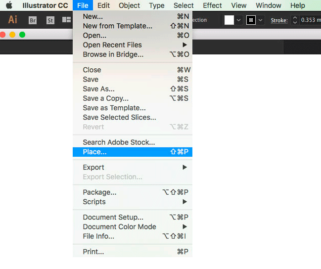
5. Save your file. File > Save as.
After each step below, save your work – Command + S.
6. We’re going to use the Image Trace tool, to turn your signature, into a vector ai (adobe illustrator) file.
7. Click on your scanned signature using the Selection Tool.
It’s the clear arrow tool circled in pink below.

8. Go to Window > Image Trace.
The panel below will help you convert your signature into a vector image.
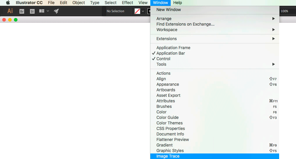
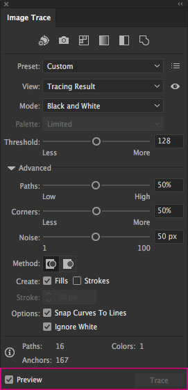
9. Check Preview. A tick will appear in the box next to the word.
You’ll now be able to view the adjustments you make.
Turning your traced signature into your logo
As you can see on the Image Trace panel above, when you click the Advanced arrow down you can see all the options available to you.
Threshold – found above the Advanced option
Paths, Corners & Noise – found under the Advanced option.
Threshold option
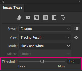
Following the example above, click on Threshold – This helps smooth out the letters.
Move the slider towards More to bring in any parts that may be missing from your scan.
This action can also make the lines appear thicker. If you go too high, the lines will start to look rough as it adds in extra points.
Moving the slider toward Less will take away parts of the scan and make lines thinner.
I like to leave the slider around the middle or a bit above. (As shown in the panel above) But, play around with the slider until you’re happy with the overall look.
Paths option
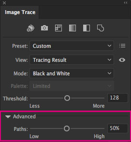
- Click on Paths.
Move the slider towards More, to bring in more points and handles.
If you add in too many anchor points, the lines won’t look smooth. - Moving the slider to Less has the opposite effect. If you go too low, your letters may appear to have pointy ends.
I like to stay around the medium part of the slider or below. Play around until you’re happy. - Zoom in and out with your magnify tool, to see how the two options affect your scan.
If you want your logo to have a smooth look, keep your paths slider around the middle (50%).
Corners & noise option
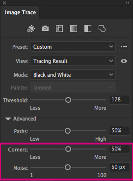
- Corners. Using the slider will add or take away corners and points on your scan. Again, you can place this around the middle (50%).
If your signature has a lot of flowing lines over each letter, you may need to move the slider up to high, so it creates smooth, rather than sharp corners. - Noise. As a general rule, I place this around the middle (50%).
But play around with the slider if you feel it needs adjusting.
The final steps
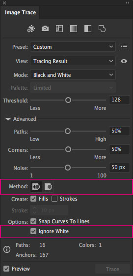
- You want your finished logo to have no background.
In the Image, Trace Panel go to:
• Method – click on the first box
This creates a cutout of your logo (similar to a cookie cutter)
• Options Check Ignore White
A tick will appear in the box next to the word. - The next step is to Expand your traced signature, turning it from a scanned image into a vector file. It will also give it anchor points and handles.
- Expand is found in the header panel as shown below.

If needed, you can now edit it. Ungroup (command + shift + g) all the elements of your signature so if needed, you can edit them individually.
4. Save your signature as a .svg file (Scalable Vector Graphics) for website use, and as a .eps or .pdf for print use such as business cards.
Try doing this for an extra polished look
If parts of your signature need a bit of extra care, I always use
The Smooth Tool. It’s under the pull-out menu with the pencil.
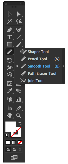
If a certain area has too many anchor points or isn’t as smooth as you would like it, select that part and place the smooth tool on the individual anchor point or run it over the entire area.
Your signature is now ready to be used as your logo and added to your website.

Logo tip 2: Add details to your new signature logo
If you want to add more details to your new logo, (such as the full name of your business underneath), pick a font that matches the style of your brand.
I always suggest using Google fonts rather than purchasing a set of fonts for your first logo. Fonts can be expensive to buy, while Google fonts are free and still beautifully designed.
In my logo example below, I used the Chronicle Display font. But, you can always find a Google font substitute for a traditional font. In this case, I would suggest Bentham.
And, once you find the font you love, select, download and load it into your font program on your Mac, and type away.

Logo tip 3: Create a logo suite
A suite is a collection of different styles of your logo. From years of working in corporate design studios, this is what every multi-million dollar company included in their brand and style guidelines. So you can look like a pro, even if you’re not there yet!
A logo suite includes a horizontal, vertical and monogram version of your logo. Start with a mono version and then add a coloured one to match your branding.
Primary Logo: This will be the logo you use the most. It will be horizontal in shape as a signature is usually wider than higher making it horizontal in shape.
Secondary Logo: A horizontal logo might not always fit in a certain space. To avoid squashing or shrinking the logo (making it unreadable), create a second version. This could be a vertical-style logo meaning it will be higher than it is wider. For your signature, that could mean placing your first name on the top and your surname below it.
For my secondary logo, I stripped out all the details and used my initials and just the word design to describe the business. (See example above).
Monogram: This version of your logo, involves taking your initials and interweaving them together to create a motif. This can be used to watermark your work, use it as your favicon or include it in other branding and material.
Your action steps
- Sign your name using a black pen.
- Scan it into your computer.
- Using Illustrator, follow the steps in this blog to create a vector version.
- Add details to your logo.
- Create a logo suite.
- Prefer a done-for-you solution? We offer that here.
Where to next?
Prefer us to create a unique logo for you? Here’s How
Still not sure what to call your business? Read This
Heard of Signature Style, but are confused about it? We Explain all here
Want more Insider Tips?
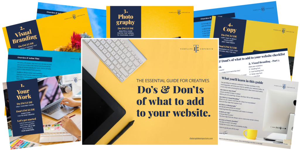
Grab our FREE Essential Guide for Creatives. “Do’s & Don’ts of what to add to your website”. We give you a simple plan to follow so that you’ll never have to question what to show online again.
Like this blog post?
PIN IT FOR LATER. And for more helpful tips follow us on PINTEREST.

Search
Create & launch your website in a
few simple steps
FREE GUIDE
While you’re here,
grab our FREE
‘Do’s & Don’ts of what to add to your website’ Guide.
‘Do’s & Don’ts of what to add to your website’ Guide.
When you sign up, we’ll send you
emails with additional helpful content.
About Lavinia & Tom
Hi, we're so glad you found us.
We love helping creatives like you finally have the website you’ve always wanted.
Blog Categories
Follow us