grab our FREE
‘Do’s & Don’ts of what to add to your website’ Guide.
‘Do’s & Don’ts of what to add to your website’ Guide.
emails with additional helpful content.
Hi, we're so glad you found us.
We love helping creatives like you finally have the website you’ve always wanted.
few simple steps
Follow us
3 Reasons Why Not Adding Your Favicon is Hurting Your Website
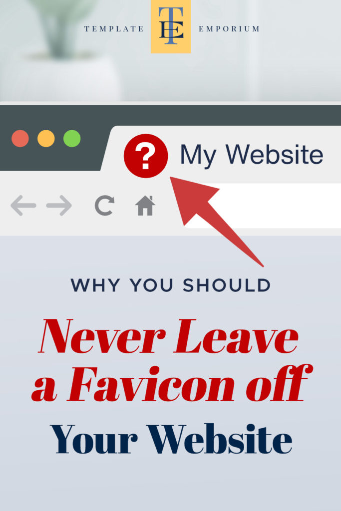
Adding unexpected details to your website is what makes it truly unforgettable, and not including the tiniest detail of all, your favicon, could be hurting your website.
In this blog, we explain everything you need to know about favicons. From what it is, to what it looks like, how big it should be, design tips on creating your own and how leaving a favicon off your website could be hurting it more than you realise. Let’s dive in.
Before we start, check out our Website Series below.
- Is your website breaking the law?
- Why do I need a Domain name? (and what do I do with it?)
- What is a One-Pager Website (& why do I need one?)
- Do’s & Don’ts of What to Add to Your Website
- Top Website Mistakes creative professionals make (& how to avoid them)
What does Favicon mean?
The word favicon is an abbreviation of the two words “favourite” and “icon”.
While browsing the web, you have more than likely come across hundreds of favicons.
Below is an example of our Template Emporium favicon, along with some other well-known ones from Instagram, Google and YouTube.

The main job of this small graphic icon is to represent and identify the website and its pages in a browser across the web.
You probably were not even aware that this icon had a name. Or like most people, have never given it a second thought.
Now you know what it is, the way you think about favicons is all about to change. We are going to show you how vital this tiny icon is to the overall experience of using your website.
But before we do, let’s discover a little more about what it looks like, where to find it and most importantly, why you need one for your website (Now!).
What does a Favicon look like?

Every website should have its own unique favicon.
And the more custom you make it, the more memorable it will be.
One thing all favicons have in common, though, is that they will be the smallest image on the website or web page.
This little image can look like anything. However, it is often a simple version of the logo or icon associated with the website’s business.
Favicons are often square icons, but circles are another favoured shape.
Alternatively, it may have no shape at all and instead include a transparent background with letters or a graphic.
We chose this style with our TE monogram icon, as shown in the example below.

Wherever you opt for a shape or no background, it is always recommended to keep it simple in design, creating a clear and easy-to-identify graphic.
Where do you find a Favicon?
Found in a variety of areas, the three main sections we are going to look at are:
1. In the Browser Tab
Head to the tabs in your browser. There, you will find the favicon always sits on the left-hand side of the name of the website. Example below.

2. In the Bookmarks Toolbar
Moving down from the browser tab, you’ll find the bookmarks toolbar housing your favourite websites. And of course, the corresponding favicon to each site is outlined in red below.

3. In the History Panel
Heading back up above the browser tabs, to the History panel, favicons are everywhere as they allow us to identify the list of websites we have currently visited.
The favicons are highlighted in red below.

What does a favicon do?
Favicons are so much more than just a “favourite icon” used to represent the web pages of a site.
They help improve your branding, make your website look and feel professional and most importantly, create a smooth and easy user experience for your viewer. Let’s discover how.
1. Branding

When you begin branding your website and, even before you launch your site, you need to think seriously about what little details you can add to help take a visitor and turn them into a customer.
And the perfect place to start is with the littlest detail of all – a favicon.
Adding a favicon helps establish brand recognition immediately.
It ensures your brand looks consistent with the rest of your website. And when you leave the site, but the tab remains, your branding and colours are still visible.
Think of the favicon as the cherry on top of vanilla ice cream.
And the vanilla ice cream is the browser bar. It brings the two elements together perfectly and gives that extra pop of brand awareness.

And just like a cherry, a favicon stands out for all the right reasons by allowing your viewer to identify quickly and visually, which browser is open.
This action helps your viewer to go through a complete branded browsing experience.
But what happens when you take the cherry (or in our case, the favicon) away? Let’s check it out below.

Everything (literally) becomes vanilla and blank. That extra pop that made it so easy to identify what website you were on is now gone. The added detail of branding is gone.
After all the hard work you went through to create your site, the favicon makes it official. It finishes off the look and makes your website look complete.
Have you added the cherry to the top of your website? Keep reading, and we’ll show you exactly how.
2. A Professional Edge

When you launch your website, there are so many factors to consider.
But unfortunately, sometimes the favicon does not even make it on the list!
When we become too close to our work, we forget how other people see it. We know everything about our site, inside and out. But your viewer doesn’t.
If you want your website to stand out in a sea of tabs, you need to add a custom favicon. It’s this personal touch that makes your site feel recognisable.
Insider Tip
Have you ever seen websites with grey square boxes next to them? (See example below)
That is a Squarespace generic default favicon. And I’ve seen a lot of these squares lately, especially with small business websites that have either forgotten, can’t be bothered or don’t know how to customise them.

You and your website are far from generic, so your favicon shouldn’t be either. Leaving the default icon of your template provider makes your site look unprofessional.
While adding your custom favicon, tell your customer that you know what you are doing.
It shows that you are a credible and professional business. And without even having to tell them, you also believe in attention to detail.
We love seeing how our customers turn our Template Emporium Showit designs into their custom websites, simply by adding a favicon.
Adding a favicon to your showit website is easier than you think, and in the bonus section of this blog, we’ll give the 6-step process. (Can’t wait, scroll down to the bottom to see).
3. User Experience

If you have never heard of the term “User Experience”, you may be more familiar with its acronym – UX.
But how does that relate to a favicon?
We’re going to discover how including a favicon creates a more pleasant experience as it makes life easier for us (and your customer) to complete a task.
We discussed earlier where the three main places favicons live. Now, let’s look at how the favicon can help the “User Experience” below.
Browser Tabs
Have you ever had 20+ tabs open at the same time?
I know I have. (And your customer probably has too!). With so much information available, once you start searching across numerous websites, suddenly your browser is full.
By this stage, if you are even lucky enough to see the link name, most of it will be cut off.
As you can see in the example below, without the favicon, it would make it very tricky to know what the name of the website is.

And the more tabs open, the more the name of the website is often completely covered up by its neighbouring tab.
Adding the visual cue, in the form of the website’s custom favicon, helps guide your eye through a sea of half-cut-off words.
Bookmarks Toolbar
The favicon’s job doesn’t stop with Browser Tabs.
As you can see below, the favicons act as small buttons allowing you to quickly jump to and from your favourite sites, without even thinking.

Bookmarking websites to your toolbar makes your everyday website user experience so much smoother (and easier).
History Panel
The handy history drop-down menu is another spot (more than likely) you have taken for granted that contains our favicon friends.
The favicons are marked in the red box below.
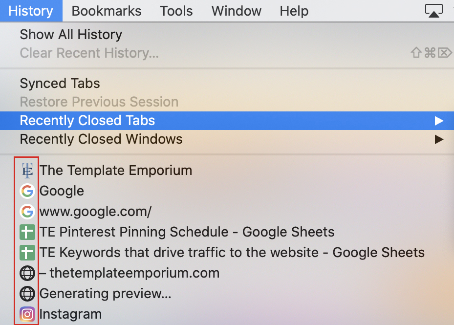
This visual reference makes searching through the websites we have visited a breeze.
How do you create a Favicon?
Most designers will use Photoshop or Illustrator to create their favicon.
But there are plenty of other programs, including using an online favicon generator. We include a few options at the end of this blog.
What size should a Favicon be?
In this post, we are going to concentrate on the best size of favicons for modern web browsers.
Whatever design you choose for your favicon, it needs to fit within the confines of a square.
The general rule for sizing is 16 pixels high x 16 pixels wide.
Insider Tip
However, to cater to retina screens*, we recommend creating them at 32 pixels high x 32 pixels wide. *A retina screen is a higher resolution than your regular screen, which is why we doubled the standard common size.
Here’s an example below of our Template Emporium favicon at the recommended size.

4 Design Tips for Creating Your Favicon
1. Don’t include your entire logo
Favicons are tiny, so instead use part of your logo.
When designing our favicon, we used the TE from our Template Emporium logo. One or two letters is the most we recommend using.

2. Make it recognisable and clear
Don’t want to use letters? Take one graphic element or small shape from your original logo that your audience identifies with your brand.
Make it easy for your customers to know it’s you. Make it stand out from the long list of tabs your viewer may already have open on their screen.
3. Keep it simple
Avoid script fonts, or small details like shading, blends or gradients.
When reduced in size, these complicated elements end up looking messy and unclear. Instead, keep to the 3 S’s – Strong. Solid. Simple.
4. Colour it
To keep it consistent with your branding, use 1-2 of your brand colours in your favicon.
When in the tab menu, your favicon will appear on a black, grey and white background. (Depending on which tab you click on). So, ensure it looks good on all three background colours.
What file type should your Favicon be?
If your favicon needs a transparent background or doesn’t fill the entire 32px x 32px square space (like our TE favicon), create a .png file. Otherwise, a .jpeg is fine to use for your upload.
Upload either your .png or .jpeg to one of the four online services we suggested in Design Tips to create a favicon.
Once uploaded, they will look after saving the file in the correct format.
It will either be a .ico file or a .png file.
INSIDER TIP: If you’re a Showit user, their preferred file format is a .png.
What’s an .ico file?
.ico stands for Icon. And, going back to the beginning of this post, we discovered that a favicon is short for a favourite icon. So this file type makes perfect sense.
BONUS – How to Add your Favicon to your Showit Website
Another reason we love using Showit for creating our Template Emporium designs is how easy it is to add a favicon to your website.
Your Favicon file
Showit accepts .png files at 32px x 32px square.
Adding your Favicon to Showit
1. Go to your SITE tab
2. Click on SITE SETTINGS
3. Your SITE INFO panel box will appear below
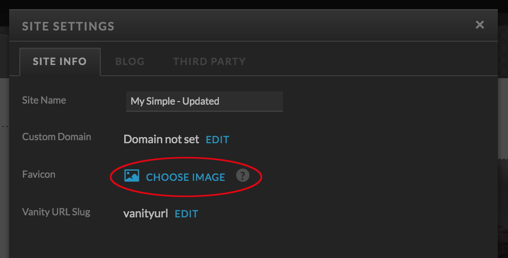
4. Click on CHOOSE IMAGE (circled above) and select the favicon you created
5. A preview will show how it will appear in your browser
6. Click PUBLISH on the right-hand side panel to see the favicon appear online

Things to know
Not every browser will display the favicon at all times.
It may take 24 hours to fully update across web browsers that have already visited your site recently.
Online Favicon Services
To create your Favicon from scratch, try these online services
Already created your Favicon, and want to convert it to the correct format?
Your Action Steps
Well, that’s a wrap on the favicon. We hope you’ve learnt something new about our favourite tiny icon, and before you go, we’ll leave you with these 3 action steps.
- Use our tips to design and create your 32×32 pixel square-shaped favicon.
- Pick one of the online services to either create or convert your favicon into the correct format.
- If you’re a Showit user, follow our 6-step guide to adding your favicon to your website
If you liked how simple it was to upload a favicon to Showit, you are going to love our simple-to-use, update and publish Showit website templates for creatives. View them in action here.
Where to next?
How to use your Brand Colours to make your website pop! Tell Me How
Want to create your website in Showit? Here’s How
Is your current website breaking the law? Find out Here
Want some tips for building your website?
Grab our FREE Essential Guide for Creatives. “Do’s & Don’ts of what to add to your website”. We give you a simple plan to follow so that you’ll never have to question what to show online again.
Like this blog post?
PIN IT FOR LATER. And for more helpful tips, follow us on PINTEREST.
Search
Create & launch your website in a
few simple steps
FREE GUIDE
While you’re here,
grab our FREE
‘Do’s & Don’ts of what to add to your website’ Guide.
‘Do’s & Don’ts of what to add to your website’ Guide.
When you sign up, we’ll send you
emails with additional helpful content.
About Lavinia & Tom
Hi, we're so glad you found us.
We love helping creatives like you finally have the website you’ve always wanted.
Blog Categories
Follow us